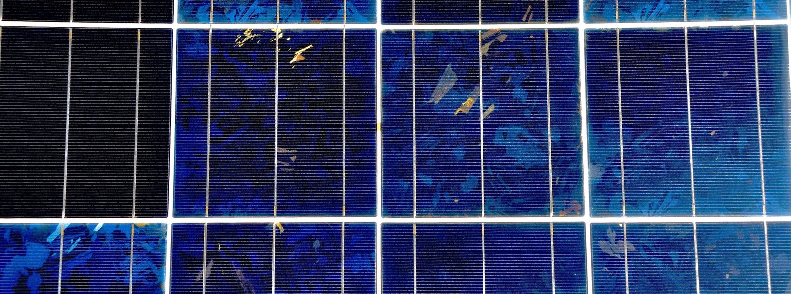
Photovoltaic cells, showing grid contacts and crystal domains. Photo Credit: Tom Murphy
13. Solar Energy
Now we come to the main attraction. As we saw in Chapter 10, all of the strictly renewable energy options are ultimately derived from the sun. The two resources of the last two chapters—hydroelectricity and wind—represent tiny crumbs of the overall solar input to the planet.
Practically speaking, it is difficult to concoct ways to harness more than a few terawatts of power from hydroelectric or wind-based resources. Similar limitations apply to biologically-derived energy, geothermal, tidal, ocean currents, wave energy, etc. This may be worrisome considering that human society currently demands 18 TW. Meanwhile, the sun delivers 83,000 TW to the earth’s surface (Fig. 10.1; p. 174, Table 10.2; p. 175). That’s almost 5,000 times more than the demand. By the numbers, then, the sun seems to offer all we might ever need. In fact, the quantitative imbalance is so extreme as to make one wonder why we would ever mess around doing anything else.
Yet at present, the U.S. gets only about 0.9% of its energy from solar power, or 2.3% of its electricity. Similarly for the world, 1.2% of global energy is solar (2.1% of the electricity). It would seem to be vastly underutilized.
This chapter explains the nature of solar energy, its potential for use, practical considerations, and looks at the state of installations. While most of the focus is on photovoltaic (PV) panels that directly generate electricity from light, solar thermal power generation is also covered.
13.1 The Energy of Light
Sec. 5.10 (p. 84) introduced the basics of the energy of light. This section acts as a refresher and lays the foundation for the rest of the chapter.
Light—a form of electromagnetic radiation—is composed of photons— individual particles of energy each having a characteristic wavelength— what we might call color. Photons are such tiny quanta of energy that familiar environments are awash in unfathomably large numbers of them. A typical light bulb, for instance, emits quintillions[1] of photons every second.
The second form is useful, as we more commonly characterize the “color” of light by its wavelength, . The speed of light, m/s, connects frequency to wavelength via
The third form in Definition 13.1.1 makes it easy to compute photon energy in Joules given the wavelength in microns.[2] Visible light has a wavelength around 0.4–0.7 (violet–to–red), so a typical photon energy, at 0.5 , is about 4 J. It’s a tiny number!
The final form in Definition 13.1.1 relates to the fact that photons frequently interact with electrons as we will see in Section 13.3, making it convenient to convert to another energy unit called the electron-volt, or eV (introduced in Sec. 5.9; p. 83). One electron volt is the energy it takes to move an electron through an electric potential of one Volt. The conversion is 1 eV J. For instance, the 0.5 (blue-green) photon we used in the previous example would have an energy around 2.5 eV.
Why should we care about unthinkably small quantities of light? Three reasons come to mind:
Eq. 13.1 elucidates that bluer[5] photons have higher energy than red photons, which is important to know;
Individual photons interact with matter at the microscopic scale and are relevant to understanding solar photovoltaics and photosynthesis;
It’s how nature really works.
13.2 The Planck Spectrum
We should first understand where photons originate, which will help us understand how solar panels work and their limitations. Until recent technological advances, photons tended to come from thermal sources. It’s true for the white-hot sun,[6] and true for flame and incandescent light bulb filaments.[7] Likewise, hot coals, electrical heating elements, and lava are all seen to glow. Physics tells us how such hot sources radiate, as covered by the next three equations. The first (with units) is:
We already saw this equation in the context of Earth’s energy balance in Sections 1.3 and 9.2. It is called the Stefan–Boltzmann law, describing the total power (in W, or J/s) emitted from a surface whose area is (in square meters) and temperature, in Kelvin.[8] The constant, is called the Stefan–Boltzmann constant, and is easy to remember as 5-6-7-8.[9]
| 1 | |
Eq. 13.4 might look formidable, but only and are variable. It describes the Planck spectrum, otherwise known as the blackbody[10] spectrum. For some temperature, , this function specifies how much power is emitted at each wavelength, . Three fundamental physical constants from key areas of physics make an appearance: m/s is the familiar speed of light from relativity; J s is Planck’s constant from quantum mechanics, and J K is the Boltzmann constant of thermodynamics.[11]
Eq. 13.5 is called the Wien law and is a numerical solution identifying the peak of the blackbody spectrum as a function of temperature. Higher temperatures mean higher kinetic energies at a microscopic scale, so that higher-energy (shorter-wavelength) photons can be produced. This is why as objects get hotter, they move from red to white, and eventually to a blue tint.
All this may seem overwhelming, but take a breath, then just look at Figure 13.1. Everything so far in this section is captured by Figure 13.1.
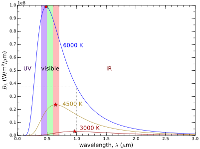
Figure 13.1:Planck spectra, or blackbody spectra for three temperatures, indicating where the ultraviolet, visible, and infrared regions lie. The shapes of the three curves (spectra) are described by Eq. 13.4, the star locations are found by Eq. 13.5, and the total power radiated, per square meter of surface is the area under each curve, as captured in Eq. 13.3. The dotted line relates to Example 13.2.2. Note the 1e8 factor on the vertical axis, meaning that the axis goes from 0 to .
The shape of each spectrum is a plot of the function in Eq. 13.4 for three different temperatures. If comparing output of Eq. 13.4 to Figure 13.1, be aware that the units have been manipulated to favor microns over meters.[12]
Let’s come at this again with numbers to help us make sense of things. Looking at the curve (spectrum) for 6,000 K, we will verify that each equation makes some sense.
Now look at the graph to see that the peak of the blue curve is indeed just short of 0.5 , denoted by the red star at the top.
Indeed, the blue curve passes through this value at a wavelength of 1 , as indicated by the dotted line in Figure 13.1.
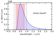
Figure 13.2:Attempts to crudely match the area under the 6000 K Planck spectrum using rectangles of three different widths. The widest (1 ; dashed line) is too much area; the narrowest (0.5 ; dotted line) is too small. The middle (0.75 ; pink area) seems closest, by eye.
Now that we’ve batted the equations around a little bit, like a cat mightdo if given a new mouse toy, let’s absorb some key takeaways. First, asthe source gets hotter, the area under the curve[14] increases drastically—as the fourth-power of , according to Eq. 13.3. This is seen in Figure 13.1 in that going from 3,000 K to 6,000 leads to a tremendous increase in area under the curve: 16 times, in fact.
Second, as an object gets hotter, it emits at shorter wavelengths, going from red-hot to yellow-hot to white-hot. The sun, at 5,800 K, peaks at 0.5 , in the blue-green region. We don’t see it as blue-green because it emits plenty of red light as well, making a blend. Notice how well the 6,000 K spectrum in Figure 13.1 covers the visible colors. A cooler star at 3,000 K has a red tint to it, since the 3,000 K spectrum (Figure 13.3) shows a marked red-heavy tilt: blue is not as well represented as red is. Conversely, a hot star at 10,000 K will have a blue tint to it, since it peaks around and has considerably more flux at the blue end of the spectrum than at the red end.
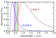
Figure 13.3:A 10,000 K star (or any blackbody) has a spectrum that tilts blue in the visible spectrum, while a cooler star (object) at 3,000 K has a red slant. Spectra are normalized to the same peak for easier comparison.
Finally, it is worth absorbing the overall lesson that photons from a glowing source emerge as a distribution, spanning a wide range of wavelengths (colors). This will turn out to be important in understanding why solar panels have the efficiencies that they do.
13.3 Photovoltaics
We are now prepared to dig into how photovoltaic (PV) panels actually work, and what governs panel efficiency.[16] The word “photovoltaic” can be loosely read as: volts from photons, or electricity from light.
Various materials are used as the principal component in PV panels, but the vast majority are made of high-purity silicon, so we will speak in these terms alone. The basic physics will be the same for other materials as well. Getting too far into the weeds in describing the semiconductor physics is outside the scope of this course, but it is worth painting a general picture—enough to appreciate how much we can expect to get out of a PV panel.
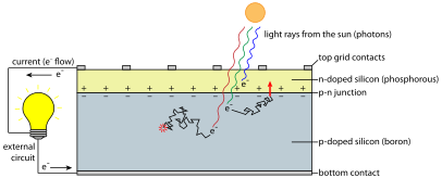
Figure 13.4:PV cell structure and function. A junction between –doped and –doped semiconductors sets up an electric field across the junction. If an electron promoted to the conduction band by an incoming photon wanders into the junction, it is swept across (red arrow) and successfully contributes to current. Electrons do not contribute if created above the junction—as is more probable for blue photons that are not likely to penetrate as far. Electrons do not contribute to the external (useful) current if they recombine (fill a hole) before finding the junction (red “poof”).
Figure 13.4 illustrates the basic scheme. The underlying idea is that adjoining two slabs of silicon into which small amounts of two kinds of impurities have been deliberately introduced[17] that either contribute extra electrons type, for negative charge donors) or create vacancies for electrons type, for effective positive charge donors). Putting doped and doped materials together creates a junction[18] exhibiting a contact potential. The result is that “donated” electrons right at the junction in the doped material decide to relocate across the junction to vacancies in the doped material, creating a wall of negative charge on the side of the junction and leaving behind “holes” (missing electrons) effectively creating positive charges[19] on the side of the junction. In the region right around the junction[20] an electric field is set up between the separated charges. Any electron wandering into this depletion region will be swept across the junction, across the contact potential, and will contribute to a current that is then driven around the external circuit to return to its side home.[21] Figure 13.4 shows additional salient features that will be pointed out as the story develops below.
13.3.1 Theoretical Efficiency of Photovoltaics
We will now follow the fate of one photon as it encounters the photovoltaic material. Doing so will expose the physical process of photovoltaics and simultaneously track losses to elucidate efficiency expectations.
The basic scheme is that a photon knocks an electron away from an atom in the PV cell, and this electron has some chance of being swept across the junction upon which it contributes to a useful current.[22] The goal is to get an electron across the line. It is not unlike some sports where crossing a line is the goal, but many factors are lined up defending against successful attainment of this goal. Efficiency is related to the chance that a photon will produce a “win.”
A photon leaves the hot solar surface aimed right at a PV panel on Earth. The photon can be any “color,” distributed according to the Planck spectrum[23] in Figure 13.1. The most probable wavelength for a 5,800 K blackbody—according to Eq. 13.5—is , but it could reasonably be anywhere from 0.2–3 . The atmosphere will knock out (absorb or scatter) most of the ultraviolet light before it reaches the panel, and some of the infrared light is absorbed in the atmosphere as well. But almost 75% of the energy[24] makes it to the panel. What happens next depends on the wavelength.
First, we must understand something about the silicon material. The atoms in a typical silicon PV cell are arranged in an orderly lattice, grown as a single crystal. Expensive panels have mono-crystalline silicon, meaning that each 15 cm square cell comprising the panel is a thin slice of one giant crystal. Less expensive poly-crystalline (or multi-crystalline) panels have cells that are a patchwork[25] of randomly-oriented crystals at the millimeter to centimeter scale. But microscopically, both types are orderly crystals. Silicon has four electrons in its valence shell (outermost shell), so that a “happy” silicon atom is home to a four-outer-electron family. These electrons are said to exist in the valence band.[26] But provided a sufficient energy kick, an electron can leave home and enter the conduction band,[27] where it can freely move through the crystal and can potentially contribute to an electric current, if it finds the junction. The threshold energy level to promote an electron from the valence to the conduction band is called the band gap,[28] which for silicon is 1.1 eV J).
Infrared photons at a wavelength of have an energy of eV,[29] according to Eq. 13.1. The energy falls below the band gap of silicon, and as such is not capable of promoting an electron within the silicon from the valence band to the conduction band. These longer-wavelength photons sail right through the silicon crystal as if it were transparent glass. Since these photons are not absorbed, the part of the incident energy in the infrared beyond 1.1 is lost. For the solar spectrum, this amounts to 23%, and is portrayed in Figure 13.5.
For the 77% of sunlight whose photons are energetic enough to bump an electron into the conduction band,[30] it’s game-on, right? Well, not so fast—literally. Photons whose energy is higher than 1.1 eV have more energy than is needed to lift the electron into the conduction band. It only takes 1.1 eV to promote the electron, so a blue-green photon at 0.5 eV) has an excess of about 1.4 eV. The lucky electron is not just lifted out, but is given a huge boost in the process, rocketing out of the atom. It’s going too fast! It knocks into atoms in the crystal and generally shakes things up a bit before settling down. We call this heat, or thermal energy:[31] its excess kinetic energy is transferred to vibrations (randomized kinetic energy of atoms) in the crystal lattice. The blue curve in Figure 13.5 reflects this loss: we get to keep all the energy at 1.1 (1.1 eV), thus the blue curve joins the overall black curve here.
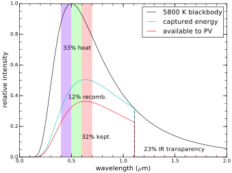
Figure 13.5:Energy budget in silicon PV cell. The areas of the four regions represent the fraction of the total incident energy going to each domain. All light at wavelengths longer than 1.1 (infrared; 23%) passes through the silicon without being absorbed. The photons that are absorbed give excess kinetic energy to electrons, losing 33% of the incident energy as heat. This effect is progressively more pronounced the shorter the wavelength. Of the remaining 44%, about a quarter disappear as electrons “recombine” with vacancies (holes) in the silicon before getting a chance to contribute to a useful current by crossing the junction, leaving 32% as the maximum theoretical efficiency.
But as the wavelength gets shorter and the energy gets higher, a greater fraction is lost to heat. Overall, 33% of the incident photon energy is lost to heat as the boosted electrons rattle the crystal before being tamed.
Now we’re down to 44% of the original incident energy in the form of conduction-promoted electrons that have shaken off their excess kinetic energy. But then here’s the rub: electrons are dumb. They don’t know which way to go to find the junction, so aimlessly bounce around the lattice, in a motion called a random walk.[32] Some get lucky and wander into the junction, where they are swept across[33] and contribute to external current. Others fall into an electron vacancy (a hole) in a process called recombination: game over.[34] Roughly speaking, about three-quarters[35] of the electrons get lucky by wandering into the junction before being swallowed by a hole. So of the 44% available, we keep 32% (called the Shockley-Queisser limit [86]).
Another significant loss arises because some photons are absorbed in the very top layer above the junction, so that the resulting electrons do not have the opportunity to be swept across the junction to contribute to useful energy. The shorter the wavelength, the shallower the photon is likely to penetrate into the cell.[36] Meanwhile, photons around 1 are likely to penetrate deep—well past the junction—making it less likely that the liberated electrons will find the junction before settling into a new home (lattice site) via recombination. Figure 13.4 reflects this color-dependence, and also depicts one electron from the blue photon being generated above the junction, which will not have an opportunity to do useful work by crossing the junction.
In total, the basic physics of a PV cell is such that 20% efficiency is a reasonable expectation for practical implementations.[37] Indeed, commercial silicon-based PV panels tend to be 15–20% efficient, not far from the theoretical maximum. This may seem like a low number, but don’t be disappointed! Biology has only managed to achieve 6% efficiency in the best-case photosynthesis (algae). PV technology beats that by a factor of three! And as we’ll see in Section 13.6, the only thing higher efficiency really does—besides driving up the price—is it makes the footprint (area occupied) smaller for the same power delivery. But it’s already small enough to comfortably fit on most roofs, so efficiency is not a chief limitation at this point.
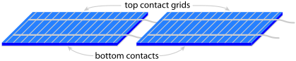
Figure 13.6:PV panels (modules) are constructed of typically 18, 36, 54, or 72 cells in series, two of which are depicted here. Cells are usually cm squares layered exactly as depicted in Figure 13.4. The bottom sides are covered by a continuous metal contact and the tops host a fine grid of metal contacts that minimize blockage of incident sunlight. Each cell presents V, arranged in series to add up to tens of volts per panel. To accomplish this, the top grid of one cell is connected to the bottom contact on the next, all down the line.
PV panels are usually constructed of many individual PV cells wired in series, as depicted in Figure 13.6. Each cell delivers maximum power when it’s at a voltage around 0.45 V, and cells are usually arranged in strings of 18, adding to about 8 V. Panels commonly have 2, 3, or 4 such strings of 18—thus 36, 54, or 72 cells total—becoming 16 V, 24 V, or 32 V devices at peak power. Figure 13.7 shows typical performance curves for a PV cell (or whole panel) operating in various light levels. Recalling from Eq. 5.2 (p. 82) that electrical power is current times voltage, the power put out by a PV panel can be found as the area of the rectangle formed from the origin to the operating point somewhere on the curve. The point that maximizes area (power) is shown in Figure 13.7 as the “maximum power point.” A battery being charged might hold the panel to a lower voltage, whose corresponding rectangle has a smaller area, thus operating at less than the panel’s maximum power.
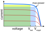
Figure 13.7:Current–voltage curve for a PV cell. The cell in full sunlight will operate somewhere on the thick blue curve, and on a lower red curve under weaker illumination. The maximum power point (mppt) is about 0.45 V for silicon, while the nominal design might be for 0.35 V so that a 36-cell panel is sized to charge a 12 V battery. Rectangle area is proportional to power delivered, since .
One serious downside of panels is that because cells are wired in series, partial shading of a single cell limits the current the whole panel delivers to that of the weakest link in the chain. In other words, 17 of 18 cells in a chain might be in full sun, but if the shadow from a roof vent, chimney, or tree shades one cell and limits its current to 10% of its full value, the whole chain[38] is knocked to 10%. Bypass diodes can isolate problem sections, but usually in chunks of 18–24 cells, so that the panel can still be seriously impaired by partial shading. Connecting panels in series also creates vulnerability to partial shadowing.
13.4 Insolation
Let’s start our journey from the physics principles we covered in Section 13.2. The sun’s surface is a sweltering 5,770 K, meaning that it emits over its surface. The sun’s radius is about 109 times that of the earth’s,[40] which itself is 6,378 km at the equator. Multiplying the radiation intensity by the area gives total power output: W. That’s one bright bulb!
Sunlight spreads out uniformly into a sphere expanding from the sun. By the time it reaches Earth, the sphere has a radius equal to the Earth–Sun distance, which is m.[41] Spreading W over a sphere of area computes to 1,360 . That’s what we call the solar constant [4], and it’s a number worth committing to memory.[42]
Earth intercepts sunlight over the projected area presented to the sun: a disk of area . Bright features like clouds and snow reflect the light back to space without being absorbed, and even darker surfaces reflect some of the light. In all, 29.3% of the incoming light is reflected, leaving 960 absorbed by the projected area of the planet. But now averaging the 960 input over the surface area of Earth cuts the number down by a factor of four,[43] to 240 .
High latitude sites suffer more from low sun angles, and obviously cloudier locations will receive less sun at the surface. Taking weather into account, a decent number for the average amount of power from sunlight reaching the ground is about 200 . This is called insolation[44]—the “sol” part of the word stemming from solar.
Table 13.1:Summary of solar power densities. Full overhead sun can be larger than the global absorbed number because the global number includes reflection from clouds, while overhead direct sun corresponds to a local cloud-free condition.
| Solar Flux Context | |
|---|---|
| Arriving at Earth | 1,360 |
| Full, overhead sun (no clouds) | |
| Absorbed by | 960 |
| Absorbed by | 240 |
| Typical insolation, includes weather | |
| Typical delivered by 15% efficient PV | 30 |
Table 13.1 summarizes these various power densities, the last line being typical insolation multiplied by 0.15 to represent the yield from a 15% efficient photovoltaic panel lying flat in a location receiving an insolation of 200 . Figure 13.8 shows global insolation, variations arising from a combination of latitude and weather.
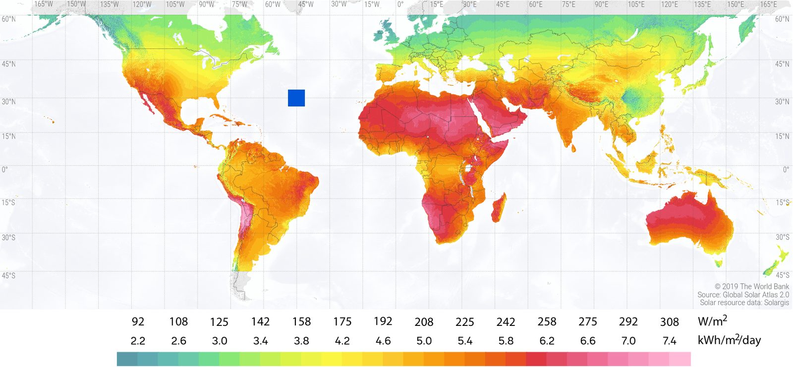
Figure 13.8:Insolation onto locally horizontal surfaces for the world (for flat plates facing directly upward), in units of and day. The area of the blue square in the middle of the Atlantic ocean is enough to satisfy current global energy demand, using
15% efficient solar collection (but distributed, of course). Source: The World Bank.
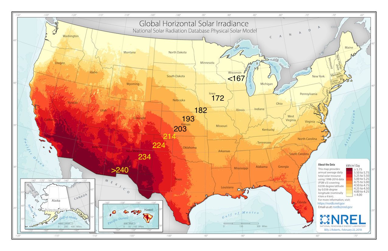
Figure 13.9:Horizontal insolation for the U.S. for a flat plate facing directly upward. Native units for the graphic are in day, the break-points between 5.75 day in steps of 0.25. These values can be converted to by multiplying by 1,000 W/kW and dividing by 24 h/day. Annotations are added once in each color band (in black or yellow) to indicate the equivalent measure in [87]. Alaska is not even close to scale. From NREL.
Figure 13.9 shows the variation of insolation across the U.S. The latitude effect is evident, but also weather/clouds make a mark, giving the southwest desert the highest solar potential. Even so, the variation from best to worst locations[45] is not even a factor of two.
Figures 13.8 and 13.9 are in the context of a flat surface.[46] For solar panels, it makes sense to tilt them to an angle equaling the site latitude and oriented toward the south.[47] The noon-time sun is always high in
the sky near the equator, so panels there should lie flat.[48] But at high northern latitudes, the sun is lower toward the southern horizon, so the panels should tilt up to best face the sun. Tilting at an angle equal to the latitude is the best compromise, as Figure 13.10 illustrates.
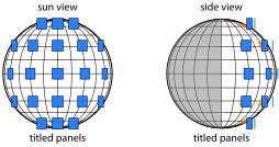
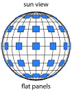
Figure 13.10:The left globe shows the sun’s view of 21 panels of the same size sitting flat on the ground at their various sites. In the middle globe, the panels are all tilted up toward the equator. Notice the improvement in how much panel area is visible to the sun by doing this—especially at higher latitudes. At right is the side view, from which it is easier to appreciate why the best tilt angle is equal to the site latitude.
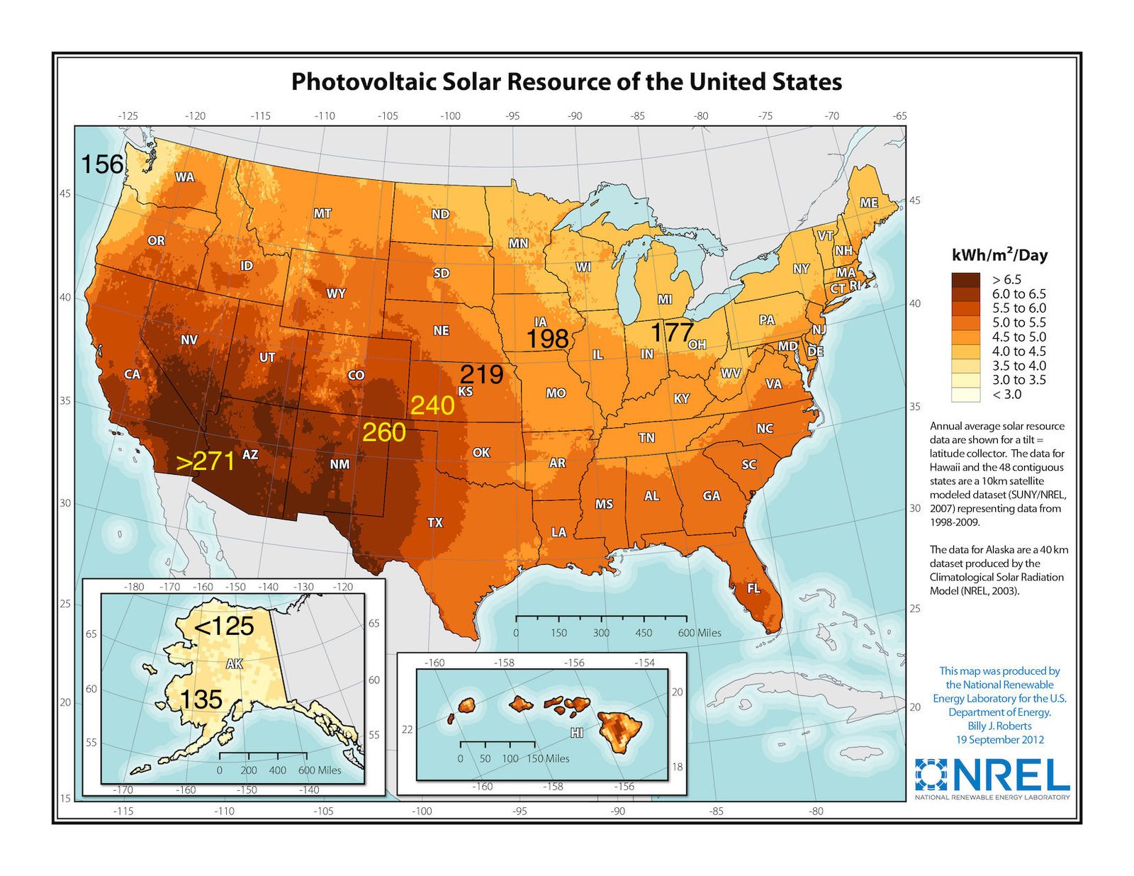
Figure 13.11:Solar potential for flat panels tilted to latitude, oriented south—relevant to PV panel installations. The graphic is presented in units of day, the break-points between colors running from 3.0 to 6.5 day in steps of 0.5. Annotations are added once in each color band (in black or yellow) to indicate the equivalent measure in [87]. From NREL.
Tilting panels toward the equator at an angle equal to site latitude optimizes annual yield, and the results are shown in Figure 13.11. Note that the numbers in Figure 13.11 are not strictly insolations, since that’s defined as what reaches flat ground. In this case, the area (square meters) is that of the panel, not of the land.
The fact that the numbers in Figure 13.11 are higher than in Figure 13.9 is not to say that the land offers more solar energy if the panels are tilted: just that an individual panel can get more light. But in this case, panels need to be spaced out to avoid shadowing,[49] as Figure 13.12 illustrates.
Some applications need to track the sun, like those that concentrate solar power, and only work when the sun is not blocked by clouds.[50] This brings us to Figure 13.13, showing the potential per square meter of collector (mirror or lens) used for the concentration (the topic of Section 13.8.2). The same pattern holds, in that the desert southwest dominates. But a look at the numbers indicates that the cloudier regions are not much better than just a flat panel facing upward (as is the case for Figure 13.9). In the southwest, where skies are often cloud-free, the boost can be
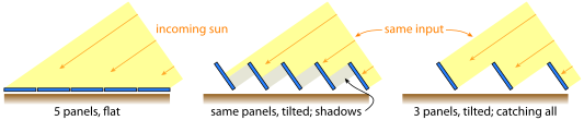
Figure 13.12:On a fixed piece of land receiving a fixed amount of sunshine at a slant angle, the amount of energy received is independent of whether the panels are flat or tilted. Just tilting the flat panels up (middle) results in self-shading. It makes the most sense to tilt and separate panels (right), one benefit being that fewer panels are needed to collect the same incident energy.
about 30% over the flat, upward-facing panel. Concentration schemes make less sense away from such regions.
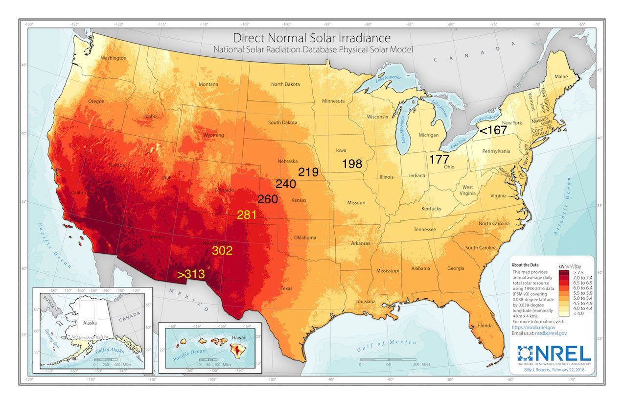
Figure 13.13:Solar potential for tracking panels, facing directly toward the sun’s position and requiring a cloud-free view of the sun (concentrating collectors). The graphic is presented in units of day, the break-points between colors running from 4.0 to 7.5 day in steps of 0.5. Annotations are added once in each color band (in black or yellow) to indicate the equivalent measure in [87]. From NREL.
Stepping back, let’s appreciate a few big-picture facets from these maps. First, numbers tend to be in the general neighborhood of 150–300 . Burn this range in—it’s a useful context. Second, the variation from the most solar-intense places in the contiguous U.S. to the weakest areas[51] is not more than a factor of two on an annual basis. This is astounding. The Mojave desert in California and the rain-forest Olympic Peninsula in Washington would seem to be practically day vs. night with respect to solar illumination. But not so much: only a factor of two.[52] Part of what this means is that if storage over annual timescales could be realized, solar power would become practical almost everywhere.[53]
Box 13.2 leads to a crucial bit of understanding on characterizing a PV system. Panels are rated on what they would deliver when illuminated by 1,000 at a temperature of .[57] So the measure in day, or full-sun-equivalent hours tells you effectively what fraction of a day the panel will operate at its rated capacity.
A 30-year study by the National Renewable Energy Lab [88] initiated in 1960 characterized solar potential across the U.S. and produced detailed statistics on what each location might expect to collect each month for panels in different orientations. Table 13.2 is a subset of the complete data for St. Louis, Missouri.[59] All cases in Table 13.2 correspond to a panel facing south, at various tilts (including flat, at and vertical at ; other tilts are relative to the site latitude of . From this, we see that tilting the panel at the site latitude delivers an annual average of 4.8 day, matching the graphic expectation from Figure 13.11. Also shown is the monthly breakdown and how different tilts translate to performance. We will visit this table again in Section 13.6 to help us establish an appropriate size for a residential installation.
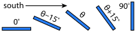
Figure 13.14:Panel tilts for Table 13.2, for .
Table 13.2:Solar exposure day) for a south-facing panel in St. Louis, MO, at various panel tilts is latitude, which happens to be for St. Louis). means a panel lying flat, pointing straight up (like on a flat roof), and means vertical, like on a (south-facing) wall (see Figure 13.14).
| Angle | Jan | Feb | Mar | Apr | May | Jun | Jul | Aug | Sep | Oct | Nov | Dec | Year |
|---|---|---|---|---|---|---|---|---|---|---|---|---|---|
| 2.2 | 2.9 | 3.9 | 5.0 | 5.9 | 6.4 | 6.4 | 5.7 | 4.6 | 3.5 | 2.3 | 1.8 | 4.2 | |
| 3.2 | 3.8 | 4.6 | 5.4 | 5.9 | 6.3 | 6.3 | 6.0 | 5.3 | 4.5 | 3.2 | 2.7 | 4.8 | |
| 3.6 | 4.2 | 4.7 | 5.3 | 5.6 | 5.8 | 5.9 | 5.7 | 5.3 | 4.8 | 3.5 | 3.1 | 4.8 | |
| 3.8 | 4.3 | 4.6 | 4.9 | 4.9 | 5.0 | 5.1 | 5.2 | 5.1 | 4.8 | 3.7 | 3.3 | 4.6 | |
| 3.5 | 3.7 | 3.4 | 3.1 | 2.6 | 2.4 | 2.6 | 3.0 | 3.5 | 3.8 | 3.2 | 3.0 | 3.2 |
13.5 The Incredible Solar Potential
The potential of sunlight can be assessed by pieces we have already seen. Multiplying the solar constant of 1,360 by the projected area of Earth and by 0.707 to account for the 29.3% reflection loss, we compute that Earth absorbs solar energy at a rate of W, or 123,000 TW (1 TW is 1012 W). Compared to the 18 TW societal scale, that’s huge! Notice that the non-reflected entries back in Table 10.2 (p. 175) add[60] to this same value.
Placing solar panels on just 10% of the land (itself 29% of Earth’s surface area) capturing the incoming energy[61] at 15% efficiency would produce solar power at TW: about 25 times today’s 18 TW usage rate. This, in turn, means that our current energy demand could be met by covering only 0.4% of land[62] with photovoltaic panels: see Figure 13.8 for a visual representation of how much this is. Solar is the only currently-available resource that can come anywhere close to satisfying our current energy appetite.[63] And it exceeds our demand by such a huge margin! We therefore have reason to be excited about solar energy: the raw numbers are great news, indeed.
So it seems like a done deal. Solar. Let’s get started! Wait, why aren’t we there yet?
Naturally, solar has some downsides. First, the cost. Panel cost has dropped to something like $0.50 or less per peak-Watt. To get 10 TW of delivered (average) power at typical locations getting 20% capacity factor[64] would require about 50 (Example 13.4.1 defines , costing 25 trillion dollars. The cost of other necessary components and installation double the cost for utility-scale projects [89], bringing the cost to $50 trillion.[65] The global annual economy is not quite twice this. To outfit the world with the requisite number of panels would take about 60% of the economy for a year, or 6% over 10 years, or 1.5% continuously.[66] For comparison, the world goes through 30 billion barrels of oil each year at a cost of $50/bbl, meaning $1.5 trillion per year. Installing enough panels to fully satisfy demand would cost three-decades-worth of the entire global petroleum budget. So it’s not going to happen fast. To put things on a personal scale, Americans use power at a rate of 10,000 W. To cover this, we would need about 50 of panel per person, costing $50k per person.[67] When can we expect your payment?
Another daunting realization is that even though only 0.4% of the land is needed to match today’s demand, this is comparable to the amount of area currently covered by roads and buildings. A road trip across the country conveys a sense for how vast (and boring) all that pavement can be. And pavement is a fancy form of dirt. It is true that PV panels are also an ultra-pure, ultra-fancy form of dirt. But it’s a different level of high-tech. It becomes hard to fathom that much PV around the world. A major impediment to solar power is its intermittency.[68] Figure 13.15 shows 31 days of solar capture, along with typical state-wide electricity demand. The two do not look very similar: not well matched. Demand is far more constant than the solar input, which is obviously zero at night. Even the peaks do not line up well, since demand is highest in the evening, well after solar input has faded away.
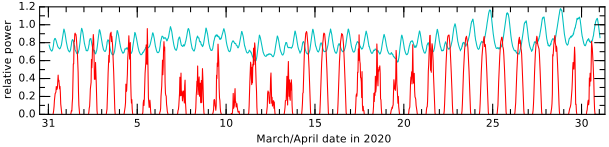
Figure 13.15:Solar input (red) and electricity demand (blue) look nothing alike. Solar data from the author’s home begins 31 March 2020, while demand is for California. Tick marks denote the start of each date, at midnight. April 22–27 are essentially perfect cloudless days, while the earlier part of the month had rainy periods. Note that even a very rainy day (April 10) provides some solar power (15% as much as a full-sun day). Intermittent clouds cause the “hair” seen on some days. The capacity factor for the month is 19%, while the perfect six days near the end perform at 27% capacity. From this, we infer that weather caused the yield to be 70% what it would have been had every day
Storage is required in order to mitigate the intermittency, allowing the choppy solar input to satisfy the demand curve of Figure 13.15. We don’t have good solutions for seasonal storage,[69] so a complete reliance on solar energy would necessitate over-building the system to handle months of low-sun conditions through winter (see the annual variation in Table 13.2), making it cost all that much more.
Finally, all energy is not equivalent and substitutable. Solar PV cannot power passenger airplanes or power our cars down the road real-time (only via storage).[70] For all its potential, the hangups are serious enough that more than 60 years after the first demonstration of a photovoltaic cell, less than 1% of our energy derives from this ultra-abundant source.
13.6 Residential Solar Considerations
Despite these drawbacks, it can still make a lot of sense[73] to invest in solar photovoltaics for the home. We’ll explore sizing and cost in this section.
13.6.1 Configurations
A typical household uses much or most of its energy when the sun is not shining: lighting, cooking, evening entertainment, charging an electric vehicle, etc. To get around this, the system would need to have local storage,[74] or be tied to the regional electrical grid so that excess production can be exported in the daytime and electricity produced by the utility used at night or when household demand exceeds solar production. The overwhelming majority of solar installations in the U.S. are grid tied, and very few mess with batteries, which can double the cost of a system and need replacement before the system has paid for itself in electricity bill savings.
While a description of the components and practical workings are beyond the scope of this book, students might be interested in an article the author wrote after first getting started tinkering with PV systems [90].
13.6.2 Sizing and Cost
How large does an installation need to be? If the goal is to cover annual or monthly electricity use in a grid-tied system, the only two pieces of information needed are the typical electricity consumption in the relevant period and the average solar input at that location for the period of interest.
The first can be surmised from electricity bills, usually giving a monthly total usage in kWh. We can get an approximate average scale from Fig. 7.2 (p. 110), which indicates that 42% of residential energy (11.9 qBtu per year) is from electricity. That’s 5 qBtu, or J in one year s), or 167 GW. Distributed among 130 million households in the U.S.,[75] average household electricity consumption is 1,285 W. Applied over 24 hours, this makes for just over 30 kilowatt-hour (kWh) per day for an average household.[76]
The next piece is solar potential at the location of interest. We’ll use the excerpted data from [88] for St. Louis, Missouri found in Table 13.2.
But panels are not marketed by the square meter. They are sold in terms of peak Watts: what the panel would deliver in 1,000 sunlight (see Example 13.4.1). How do we convert? Two ways are instructive.
We should assume that the panels will not achieve their rated potential due to the facts that:
The specification is almost never realized for a PV panel in the sun: PV panels in the sun get hot, and less efficient as a result;
The panels will get a little dirty;
The equipment that converts panel output to AC electricity is not 100% efficient.
So it’s a good idea to bump the number up by 20% or so, and order a 7.5 kW PV system for the case under study. A typical full cost (panels, electrical converters, installation) lately runs just shy of $3 per peak Watt (Figure 13.16), which in this case brings the price tag to roughly $20k. If electricity costs $0.15 per kWh—approximately the national average—each 30 kWh day costs $4.5, accumulating to $20k after 12 years. Federal and state incentives can make the payback time shorter.
What would these numbers become if trying to meet monthly instead of annual demands? December is usually the worst month for PV in the northern hemisphere, when the sun is lowest in the south, and the days are shortest. Table 13.2 backs this up, showing 3.1 day for the chosen panel orientation in December. This is about two-thirds the annual average, so we would need to increase the size of the system (and thus cost and payback time) by a factor of 1.5 to produce enough in December.[82]
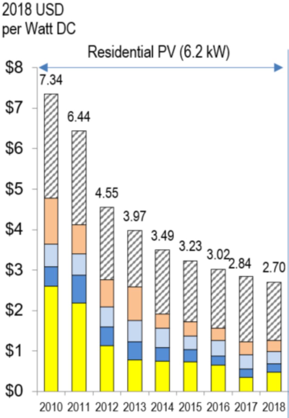
Figure 13.16:Evolving price of PV installation per peak Watt. Yellow is for the panels; the two blues for electronics; peach is labor; and hashed is for the utility hookup, inspection, taxes, profits [89, 91]. From NREL.
If sizing for an off-grid system, we need to factor in some inefficiency for battery charge/discharge and design for poorer months, so should increase by another factor of at least 1.5. The cost of batteries can be rather large, too. A good rule of thumb is to have at least three days of storage in the event of no solar input for several days during a stormy period. For our 30 kWh per day target, we would want about 100 kWh of storage. As an easy way to get a cost estimate for storage, the Tesla powerwall 2 is 13.5 and costs about $7k apiece. If we follow along, the cost of the off-grid PV system for 30 kWh/day at an installation cost of $3/W will be 7500 W $50k for panels/installation plus $56k for batteries.[84] Then the batteries may be in need of replacement every 10–15 years.[85]
If this seems rather alarming, don’t worry—there’s a trick to making it much more affordable/practical: don’t demand 30 kWh per day! Even though we picked 30 kWh/day due to the fact that it is the average American electricity demand, it is a worthwhile challenge[86] to seek ways to use far less energy than the average. Trying to make solar fit our present expectations may be the wrong approach. Also, expecting to get away from fossil fuels and have it be cheaper may be unrealistic.
13.7 Photovoltaic Installations
The Energy Information Administration’s Electric Power Monthly (EPM) [85] provides detailed statistics on power generation in the U.S. Photovoltaic data is available in the EPM’s tables 1.17.B and 6.2.B. In the usual way, we first look at installed capacity, based on the actual average delivered power. Figure 13.17 shows the situation in the U.S. California is
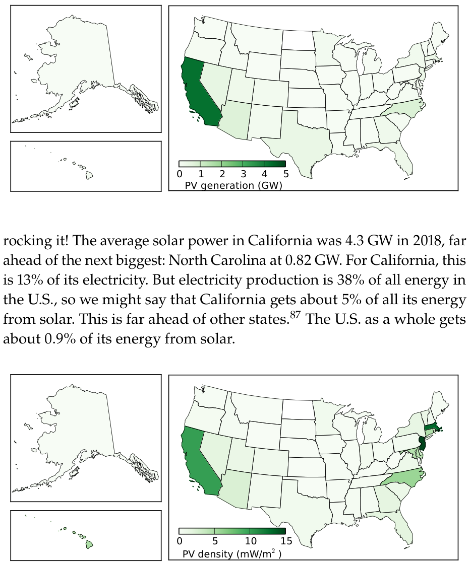
Figure 13.17:Photovoltaic power production by state, in GW, in 2018.

Figure 13.18:Photovoltaic power production areal density by state, in milliwatts per square meter.
Next, we divide by area to get power density from photovoltaic installations. A site having an insolation of 200 and 15% efficient panels has access to 30 of production capability (Table 13.1). Figure 13.18 shows how much we’re actually getting. New Jersey has its moment in the sun, here. A few sites (NJ, MA) are pushing[88] 15 , which is a factor of 2,000 lower than the full potential. What this says is that only 1/2,000 of the land (0.05%) is covered by solar panels. This sort-of makes sense, right?
On a per-population basis (Figure 13.19), Nevada shines brightest, at 180 W per person.[89] The southwestern U.S. is doing well overall, as is North Carolina on this measure.
Finally, we look at capacity factor: how much was generated compared to installed capacity (Figure 13.20). We expect something like 20%, corresponding to 4.8 full-sun-equivalent hours per day. The best states top out at about 0.27, equating to about 6.5 full-sun-equivalent hours per day. States at higher latitude and/or having more clouds will do
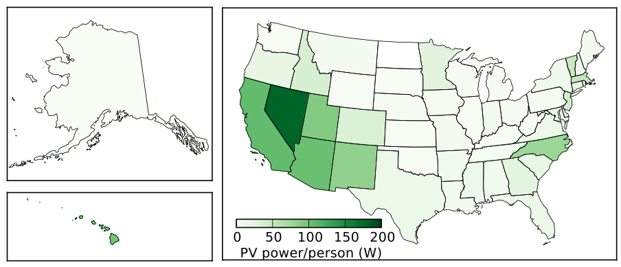
Figure 13.19:Per capita photovoltaic power production by state, in Watts per person.
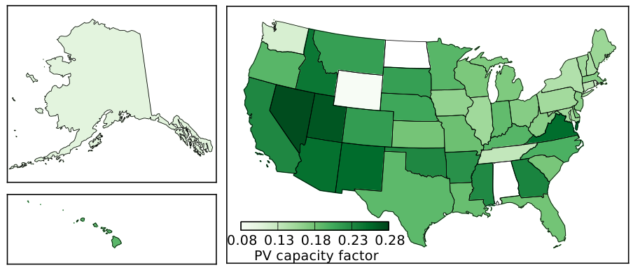
Figure 13.20:Photovoltaic capacity factors by state. While we see lots of darker green, it’s because everybody has similarly low numbers, due to unavoidable nighttime and low sun angles. Somebody tell Wyoming, North Dakota, and Alabama to get with the program!
more poorly on this measure. Alaska clocks in just over 0.1, mapping to about 2.5 hours per day, on average.

Table 13.3:Top five global producers of PV power in 2018, accounting for two-thirds of the world’s total production [92, 93]. The installed PV corresponds to peak watts , or production in full overhead sun.
| Country | installed | average (GW) | % of all energy | global share (%) |
|---|---|---|---|---|
| China | 175 | 1.2 | 27 | |
| U.S. | 62 | 10.6 | 0.9 | 16 |
| Japan | 56 | 6.5 | 3.5 | 10 |
| Germany | 46 | 5.0 | 3.3 | 7.5 |
| India | 27 | 4.1 | 1.5 | 6 |
| World | 510 | 67 | 1.5 | 100 |
Globally, two-thirds of the photovoltaic capacity is represented by five countries, shown in Table 13.3. Note that delivered power is significantly lower than installed capacity because of the low capacity factor for solar.
13.7.1 Pros and Cons of Photovoltaics
Before advancing to solar thermal generation, let’s summarize the major advantages and disadvantages of solar photovoltaics. First, the good stuff:
PV taps into a super-abundant resource—the only renewable that has such a margin;
PV technology has no moving parts or steam; panels are robust and last a long time;
PV is one of the few resources that can fit on a rooftop and provide self-contained electricity generation;
PV efficiency is rather good: close to theoretical expectations and much better than biology has managed at getting energy from sunlight;
PV technology works well, and despite expense has been deployed on rooftops across the world;
Life-cycle CO emissions are 15 times smaller than that of traditional fossil fuel electricity [68];
PV is often a good solution when utility electricity is far away.
And now the less attractive aspects:
PV is intermittent, and not well-matched to energy demand; it would be hard to “balance” the electrical grid if too much of the input came from such an intermittent source, and storage is difficult;
PV is still expensive[90] relative to prevailing energy resources— especially important in terms of up-front cost;
Electricity alone is not well-suited to many of our current energy demands, like transportation and industrial heat/processing;
Stand-alone operation requires batteries, at least doubling the cost and adding maintenance/replacement demands;
Even partial shading can be disproportionally disruptive;
PV manufacturing involves environmentally unfriendly chemicals;
PV deployment can harm habitats if installed in undeveloped areas.
13.8 Solar Thermal
Photovoltaics (Section 13.3) convert sunlight directly into electricity, but this is not the only way to harness energy from the sun. Solar energy can also be used for heat. We’ll first have a brief look at home heating, then turn to electricity generation from solar heat.
13.8.1 Passive Solar Heat
Full sun delivers something like 1,000 at the earth’s surface. Now imagine a window in a house intercepting 1.5 of sunlight, in effect admitting 1,500 W into the home—like a space heater, and it’s free! Depending on window construction, some of the infrared energy may be blocked, so maybe not all 1,000 will make it inside, but a sizable portion will. Clever design has south-facing windows for receiving low-angle winter sun, but an overhang to keep out the high summer sun (Figure 13.21). A dark and massive absorber[91] inside the house capturing the heat can continue to provide warmth through the evening hours. The Passive House designs mentioned in the context of Box 6.1 (p. 92) attempt to maximize solar capture so that little active heating is required.
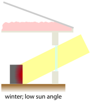
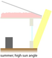
Figure 13.21:A well-designed house has thick walls, thick insulation, and doublepaned windows. Even better, it can have south-facing windows that admit sunlight in the winter but not in the summer (the overhang shields the window). A large, dark thermal mass—stone or brick works well— can absorb energy and continue to release heat into the evening.
13.8.2 Solar Thermal Electricity
While 1,000 is nice, the power is too diffuse to get anything very hot and create a large enough to allow the operation of an efficient heat engine (Sec. 6.4; p. 93). More complex arrangements can concentrate solar power—think of a magnifying glass—to heat up a liquid in pipes. Figure 13.22 shows an example of a parabolic reflector that can track the sun to concentrate light onto the energy-absorbing central pipe. This shape can be extruded along a long cylinder—a “trough”—following the pipe.
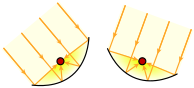
Figure 13.22:Solar trough cross sections showing the focusing of sunlight onto a central pipe. The troughs can be oriented to follow the sun.
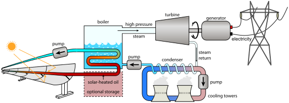
Figure 13.23:A common solar thermal power scheme uses parabolic “trough” reflectors to focus sunlight onto a central pipe, which carries oil that can be heated to very high temperatures for making steam to run a traditional electrical power plant very much like that of
Fig. 6.2 (p. 95). Optional thermal storage can save heat for later use.
Figure 13.23 shows a schematic representation of a typical solar thermal (ST) collector, and a picture of one appears in Figure 13.24. A curved reflector tilts to track the sun, concentrating light onto a long pipe in front of the reflector carrying a fluid (usually oil) that can be heated to a high temperature by the absorbed sunlight. The hot oil pipes can then be run through water to boil it and make steam, thereafter driving a traditional steam power plant. Such ST arrangements are sometimes called concentrated solar power (CSP). Another common variant—called a “power tower”—is shown in Figure 13.25, in which an array of steerable flat mirrors on the ground direct sunlight to the top of a central tower to make steam.
As for efficiency, solar thermal is at face value similar to PV: 15–20% is fairly typical. Broken down, roughly 50–75% of the available energy successfully transfers to the fluid, and then the heat engine delivers about 25–30% efficiency. But these numbers only apply if we count just the area of the reflective collector. Because they have to track the sun, and self-shadowing is to be avoided, only a small amount of the land area is occupied by the reflectors. Characterization of real facilities indicates that only 3% of the solar energy hitting the patch of land corresponding to the power plant is exported in the form of electrical energy.
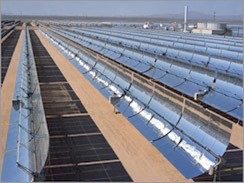
Figure 13.24:Parabolic trough-based ST plant, in which part of the power generation facility is seen in the background. Reflectors must be spaced out to prevent self-shadowing. From U.S. DoE.
But efficiency is not everything. 3% of a gigantic resource like solar energy input can still be tremendously large. It translates to over 6 for a standard insolation of 200 , which is about thirty-times better than wind, per land area. While a field of PV panels outperform an ST installation by a factor of 5–6, the technologically simpler solar thermal designs can be more cost effective than PV. Reflectors and oil pipes are low-tech cheap devices, compared to photovoltaic material. The production cost for solar thermal is estimated to be about $0.06/kWh, which is lower than the typical retail cost of electricity, but still a factor of two higher than fossil fuel electricity production costs.
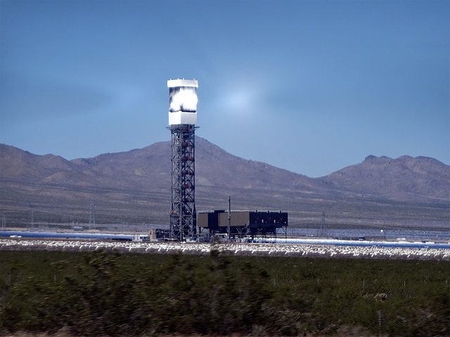
Figure 13.25:One of three “power towers” of the Ivanpah facility in California. By Craig Dietrich.
One disadvantage of solar thermal is that concentration only works when the sun itself is visible in the sky: no obscuring clouds. One way to think of it is: if you can’t see your shadow, solar concentration will not work. Meanwhile, PV panels will still produce a meaningful amount of daytime electricity from the bright sky and clouds even if the sun itself is not “out.”
Balancing this disadvantage is the fact that solar thermal has some built-in storage capacity, in that the heated oil can be “banked” for some hours[92] and continue to produce electricity even during the passage of a cloud or for a few hours into the evening. In this sense, it can better match the peak of electrical demand (early evening: Figure 13.15) than can PV, which goes to zero once the sun sets.
As seen in Figure 13.13, the desert southwest is the best place in the U.S. for solar thermal electricity generation. It makes sense that deserts would be good spots, since effective concentration requires no interference from clouds. Incidentally, transmitting electricity over intermediate distances (across regions) is fairly efficient: typically better than 90% for distances shorter than km. In terms of implementation, solar thermal is a small player. In 2018, only four states produced solar thermal power, 68% from California and 22% from Arizona. Table 13.4 provides some context, comparing ST to PV in each of the four states that have any solar thermal. For the entire U.S., less than 0.1% of electricity derives from solar thermal, and PV is about 25 times bigger on the whole. Globally, ST averages about 1.1 (2016), about half in Spain and a third in the U.S.[94]
Table 13.4:Solar Thermal (ST) generation in the U.S. in 2018, compared to photovoltaic (PV); MW is megawatts.
| State | ST MW avg. | ST % elec. | PV MW avg. | PV % elec. | ST/PV % |
|---|---|---|---|---|---|
| California | 281 | 1.25 | 4,285 | 19.0 | 6.6 |
| Arizona | 89 | 0.08 | 765 | 5.1 | 11.6 |
| Nevada | 35 | 0.09 | 552 | 12.1 | 6.3 |
| Florida | 6 | 0.002 | 326 | 1.2 | 1.8 |
| U.S. total | 410 | 0.086 | 10,565 | 2.2 | 3.9 |
13.8.3 Pros and Cons of Solar Thermal
Summarizing the pros and cons for solar thermal (ST), starting with the good aspects:
ST taps into a super-abundant resource—the only renewable that has such a margin;
ST technology is low-tech and inexpensive, using well-developed power plant technologies;
ST has built-in short-term storage capacity for covering evening power demands;
Life-cycle CO emissions are 20 times smaller than that of traditional fossil fuel electricity [68].
And the less great stuff:
ST requires direct sunlight; intolerant of clouds;
ST is only possible at utility-scale, requiring a power plant;
ST has a lower land-area efficiency than PV panels;
Some disruption will be imposed on the local environment/habitat.
13.9 Upshot for Solar
Hands down, solar is the only renewable resource capable of matching our current societal energy demand. Not only can it reach 18 TW, it can exceed the mark by orders of magnitude. Finding space for panels is not a limitation. The efficiency of PV panels is perfectly respectable based on physics expectations, and beats the best that biology has done by a factor of 3–4. The efficiency is high enough that roof space tends to be more than sufficient to satisfy the demands of individual houses.
Holding solar back is its intermittency[95] and high up-front cost. Intermittency can be solved by battery storage, but this can double the cost and require maintenance and periodic battery replacement. Additionally—as for many of our renewable options—all of our society’s demands[96] are not well met by electricity generation.
Sizing up a PV installation is fairly straightforward. Having first determined how many kWh per day are to be produced, on average, divide this by the day value for the site,[97] which is essentially the number of hours of full-sun[98] equivalent, and tends to be in the 4–6 hour ballpark. This says how many kilowatts the array should produce in full sun (peak Watts). For instance, if only 10 kWh/day are needed,[99] and the region in question gets 5 day, the system needs to operate at a peak power of 2 , costing about $6k to purchase and install (grid tied). Inflating by 20% offsets unaccounted losses[100] to better match real conditions.
Solar thermal energy is another way to run a traditional steam-based power plant, using relatively low-tech mirrors and pipes to concentrate solar energy into a heat-carrying fluid that can later make steam. Effective efficiencies are relatively low,[101] but on the bright side, the low-tech nature makes it fairly cheap, and the technique can accommodate some degree of thermal storage for use some hours into the evening. Anything[102] starting from solar input has the potential to be a major player, given the TW scale of solar energy incident upon the earth.
13.10 Problems
If we had two monochromatic (single-wavelength) light sources—a green one at and a near-infrared one at — each emitting photons at an energy rate of 1 W,[103] how does the number of photons emerging per second from each source compare? Is it the same number for each because both are 1 W sources, or is it a different number—and by what factor, if so?
Overhead sunlight arrives on the surface of the earth at an intensity of about 1,000 . How many photons per second strike a solar panel whose area is 1.6 square meters, if the typical wavelength is
Using the setup in Problem 2, how many photons enter your pupil every second if you look directly at the sun? When doing so, your pupil restricts to a diameter of about 2 mm.
The dimmest stars we can see with our eyes are thirteen orders-of-magnitude[104] dimmer than the intensity of the sun. Building off of Problem 3, how many photons enter your eye per second at this edge of detectability?
Warm humans at K and glowing-hot light bulb filaments at K both radiate according to Eq. 13.3. How much more power per unit area does an incandescent filament emit compared to human skin, roughly?
The outcome of Problem 5 indicates that a hot light bulb filament emits thousands of times more power per unit area than human skin. Yet both a human and a light bulb may emit a similar amount of light[105]—both around 100 W. Explain how both things can be true?
At what wavelength does the Wien Law say the Planck spectrum will peak for a temperature of 4,500 K? Express your answer in microns and compare to Figure 13.1 for confirmation.
Human bodies also glow by the same physics as the sun or a light bulb filament, only it is too far out in the infrared for the human eye to see. For familiar objects (and human skin) all in the neighborhood of 300 K, what is the approximate wavelength of peak blackbody radiation, in microns?
We might describe the efficiency of a light bulb as the fraction of its total light output that falls within the visible range. If using a thermal source[106] why would you expect it to be impossible to reach 100% efficiency at any source temperature, based on what Figure 13.1 shows?
Using a technique similar to that in the text, approximate the height and width of a rectangle that has comparable area to the spectrum for K in Figure 13.1. Compute the area of your rectangle and compare to the expectation from .
What are two reasons that blue photons are disadvantaged in terms of having their energy contribute to useful current in silicon photovoltaics?
Which photons are most responsible for heating up a silicon photovoltaic panel in full sun: blue photons or infrared photons (beyond 1.1 ?
If a blue photon having 3.3 electron-volt of energy liberates an electron in silicon, whose band gap is 1.1 eV„ what fraction of the photon’s energy is “kept” by the electron once it settles down from the excess?[107]
If a 2.5 electron-volt photon liberates an electron from silicon with a 1.1 eV band gap, how much kinetic energy does the emerging electron have? Express in both eV and Joules, and then determine the velocity of the electron if the electron mass is 9 kg.
Briefly summarize the sequence of events[108] that results in a
successful contribution to PV current, starting with a green photon leaving the sun and ending with an electron crossing the junction.
Many people have an instinctive reaction to discount the PV panel efficiency as disappointingly low—perhaps thinking they should hold out for higher. Present a multi-point argument about why the efficiency is actually pretty good, and why in practice it is plenty good enough to be practical.
If aiming for a particular power output[109] from a PV array, describe explicitly/quantitatively how PV panel efficiency interacts with the physical size (area) of the array. For instance, what happens if the efficiency doubles or is cut in half, while keeping the same target output?
Make the connection between Figure 13.4 and Figure 13.6 by drawing a zoom-in of the bottom left corner of one of the cells in Figure 13.6.
Figure 13.7 shows operational curves of a PV cell for different levels of illumination. If the illumination is low and the panel continues to operate at maximum power,[110] which changes the most compared to full-sun operation: the voltage or the current? Why might lower light (fewer photons) directly connect to a lower current based on the physics of PV operation?
Replicate the calculation on page 216 (showing work) that starts with the surface of the sun being 5,770 K and finds that we receive 1,360 at Earth.
According to Figure 13.8, which continent appears to have the most solar potential? How would you rate China? Do the largest populations and/or largest energy consumers in the world tend to be well-aligned to the best solar resources?
Examine Figure 13.9 to determine the insolation at the “four corners” location where Arizona, New Mexico, Utah, and Colorado touch. Express this in both day and in , showing how to convert from one to the other.
What is a typical value for hours of full-sun-equivalent[111] of solar exposure in the U.S. based on the map and native units in Figure 13.9? Explain how you arrive at this.
A 30 year study by the National Renewable Energy Lab[112] indicates that in San Diego, a typical year delivers an annual average of 5.0 day of insolation for a flat panel facing straight up. Convert this to .
The same study mentioned in Problem 24 finds that worst year in San Diego delivered an annual average of 4.7 day and the best gave 5.2 day for a flat horizontal panel. What, then, is the range of annual average insolation values in units of for San Diego, and what percentage variation is this, roughly (in round numbers)?
The study from Problem 24 finds that a flat panel facing south and tilted at various angles[113] relative to the horizontal produce the following annual average yields in units of day:
| Angle | Jan Feb Mar Apr May Jun Jul Aug Sep Oct Nov Dec Year |
|---|---|
| 3.1 3.9 4.9 6.1 6.3 6.4 6.9 6.5 5.4 4.4 3.4 2.9 5.0 | |
| 4.1 4.8 5.6 6.4 6.3 6.3 6.8 6.7 6.0 5.3 4.5 3.9 5.6 | |
| 4.7 5.3 5.8 6.3 5.9 5.8 6.4 6.5 6.1 5.7 5.1 4.6 5.7 | |
| 5.1 5.5 5.7 5.9 5.2 5.1 5.6 5.9 5.8 5.8 5.4 5.0 5.5 | |
| 4.5 4.3 3.9 3.2 2.4 2.1 2.2 2.9 3.6 4.4 4.6 4.5 3.5 |
What tilt delivers the best yield for the year, and how much better is this (in percent) than a flat plate facing straight up? What tilt appears to result in minimal seasonal variation?
What if you adjusted the tilt of panels throughout the season to maximize yield? Reproduce the table above, but only writing in the highest number for each month.[114]. What average does this track produce for the year, and how much improvement (in percent) does this represent compared to the best fixed-tilt performance?
If typical insolation is 200 , how much land area would be needed for a 15% efficient flat PV array supplying an average of 10 kW of power—which is the U.S. individual share? If arranged in a square, how large is the side-length of this array? Compare its size or area to something familiar.
If typical insolation is 200 , how much land area would be needed for a 15% efficient flat PV array supplying an average of 10,000 W for every person in the U.S. (population 330 million). If arranged in a square, how large is the side-length of this array? Draw it on top of a state of your choice, to scale.
Based on what is presented in the text,[115] why is solar power still such a minor player if it is so hugely abundant and the technology has been around for a long time? What are some of the challenges?
You look at a PV panel and mentally estimate it to measure about 0.8 m by 1.5 m. Knowing that PV panels tend to be 15–20% efficient, you guess that it is 18% efficient. How much power would you expect it to deliver in full sun (1,000 incident)?
According to the table in Problem 26, San Diego can expect an annual average solar yield of 5.7 day when the panel is tilted to the site latitude and facing south.[116] If a household seeks to produce a modest 8 kWh per day using 16% efficient panels,
how large will the array need to be? Express as an area in square meters, and in side length for a square of the same area.
Using the parameters from Problem 32, interpreting the solar yield as daily hours of peak-sun-equivalent (at solar exposure of 1 what should the array size be in terms of peak Watts in order to deliver 8 kWh per day? How much would the system cost to install at $3.00 per ?
One way to look at solar payback time time is to note that an installed system will cost something like $3,000 for each (peak capacity), and that you’ll produce kWh from that 1 array if your region gets hours of full-sun-equivalent on average. Since each kWh of electricity costs something like $0.15, it becomes straightforward to compute the value per day as $, and determine how long to match the $3k investment. The result is independent of the actual array size, depending only on the cost per , the solar yield at your location, and the cost of electricity. What would the payback time be, in years, if the cost is $,[117] the yield is 6 hours per day of full-sun-equivalent, and electricity in your region costs $0.15/kWh?
From Table 13.3, compute the capacity factors for the countries listed, and for the whole world, based on average vs. installed power. What is a characteristic range of numbers, and why[118] is it so low? Which country does the best, and which does the worst? What clues does Figure 13.8 offer as an explanation?
How much power would a large window measuring 2 m wide and 1.5 m tall admit if the sun were shining straight[119] into the window from a cloudless sky? How many kilowatt-hours does this translate to over a four hour period, and how much is it worth monetarily compared to electricity at $0.15/kWh?
Solar photovoltaics are practical for individual homes, but solar thermal is only to be found in large utility-scale installations. What is the practical reason why we should not expect solar thermal installations on peoples’ rooftops for electricity generation?
Solar thermal has a fairly low efficiency in terms of land area of about 3%, compared to 15–20% for PV. Many would shake their heads and say that’s too low to be of any use. What is the counter-argument that it may be fine?
A quintillion is 1018.
One micron, or micro-meter, abbreviated , is 10-6 m.
… 0.4 times 1,000
… or try reasoning it out: 1019 of them would make 4 J, so we need more
… shorter wavelength
… and thus stars and even the moon, which is just reflected sunlight
Modern lighting like fluorescent and LED sources rely on manipulating energy levels of electrons within atoms and crystals.
Recall that temperature in Kelvin is the temperature in Celsius plus 273 (273.15, technically).
The Stefan–Boltzmann constant is actually a witch’s brew of more fundamental constants (Planck’s constant), (speed of light), and (the Boltzmann constant) as .
The term blackbody effectively means a perfect emitter and absorber of thermal radiation.
This last one may be more familiar to students in its chemistry form of the gas constant , where is Avogadro’s number.
Eq. 13.4 uses units of meters for , but Figure 13.1 uses microns , or 10-6 m) for convenience. Also, Eq. 13.4 delivers an answer in units of per meter of wavelength, but for the plot we divided by 106 so it would be per micron of wavelength. By taking care of this detail, the area under each curve in Figure 13.1 should match as in Eq. 13.3.
Numerically, the numerator is , the denominator is 10-30, and the argument in the exponential is 2.4, so that the second fraction is 0.1.
… total power emitted 15: … doubling temperature
Solar thermal generation will be covered in Section 13.8.
… either during or after the semiconductor crystal growth; a process called “doping”
So-called junctions form the basis of diodes and transistors.
When a (negatively-charged) electron leaves an otherwise neutral medium, the medium becomes more positively charged.
… called the “depletion region,” as electrons have been depleted from the portion of the side adjacent to the junction
Once it is “home,” the electron will fill a vacancy created by a sun-liberated electron to end the journey.
Current is just flow of charge, and in this case is just movement of electrons through the external circuit.
The spectrum can be thought of as a probability distribution for photon wavelength, if picking out one photon.
This is roughly 1,000 out of the 1,360 incident at the top of the atmosphere (the solar constant, which will be derived in Section 13.4).
See banner image for this chapter on page 207.
The term “band” is used to describe energy levels. The valence band is a lower energy level.
… higher energy level
… difference between conduction and valence band energy levels
That happens to correspond to 1.1 eV is a numerical coincidence, but perhaps convenient, in that remembering 1.1 for silicon covers it from both directions.
… denoted as in Figure 13.4
Solar panels in the sun get pretty hot.
… sometimes called drunken walk, depicted as meandering paths in Figure 13.4
… red arrow in Figure 13.4
… red “poof” in Figure 13.4
Naïvely, 50% are lucky and wander up to the junction, and 50% make the wrong choice and go down. But even those initially going down still have a chance to wander back up to the junction before time expires and they recombine, so that effectively 75% make it.
Any given photon has a probability distribution of being absorbed as a function of depth. Blue photons can penetrate deep, but are more likely to be absorbed near the front surface. A 1 photon can be absorbed near the front surface, but it is more likely to penetrate deeper into the silicon.
Fancy, very expensive multi-junction PV cells may be used for special applications like in space, where size and weight are extremely important and cost is less of a limitation. These devices can reach efficiencies approaching 50% by stacking multiple junctions at different band gaps, better utilizing light across the spectrum.
… because in series, each cell shares the same current
Making things worse, the voltage drop in the lines is proportional to current, diminishing an already small voltage to even less by the time it gets to its application.
Why this convoluted path? Context. Building from pieces we are more likely to know/remember better engages our understanding and ownership of the material.
… million kilometers, or 1 AU
See: isn’t it satisfying to know that the number comes from somewhere? It’s not just a random fact, but connects to other pieces. That’s what the earlier margin note meant about context.
We can understand this factor of four as two separate factor-of-2 effects determining how much solar power a particular location receives: one is simply day vs. night: half the time the sun is not up. The other half relates to the fact that the sun is not always overhead, so the amount of light hitting each square meter of land is reduced when the sun’s rays are slanting in at an angle.
… also called global horizontal irradiance
… e.g., 250 vs. 150
… as is the definition of insolation
… toward the south for northern hemisphere locations; a more generally correct way to say it would be “toward the equator”
… point mostly up
… which can be more devastating than just fractional area blocked, due to series arrangement of cells in panel modules
Photovoltaics still produce 10–50% of full capacity under cloudy skies during daylight hours, depending on how thick the clouds are: daylight still means photons.
… ignoring Arctic-leaning Alaska
The northwest benefits from long summer days when clouds are also less likely.
This would require huge storage capacity: giant batteries, for instance.
The hours in numerator and denominator cancel, since the kilowatt-hour is kW times hours.
It’s 1,360 at the top of the atmosphere, and the atmosphere blocks/scatters some of the wavelengths outside the visible part of the spectrum.
This equivalence relies on the convenient fact that full overhead sun is about 1,000 . It would not work otherwise.
The 1,000 is reasonable, but a photovoltaic panel in full sun will be about 30– hotter than its surroundings (it gets hot!), so it would have to be very cold outside to meet the specification of panel temperature. Solar panel performance wanes when hot, and will only reach 85–90% of rated capacity in typical conditions.
We would need to apply a de-rating of 0.85 to 0.9 to account for typical PV temperatures in the sun, bringing the panel to about 45 W average power.
… a fairly typical solar location in the U.S.
… 83,000 TW plus 40,000 TW absorbed by the surface and atmosphere, respectively
… out of the 123,000 TW total
… 1/25 of the 10% starting point
As we have seen, global wind may be limited to a few TW, and global hydropower would be hard-pressed to reach 2 TW.
20% of 24 hours corresponds to 4.8 full-sun-equivalent hours per day.
The cost over the year lifetime of the panels is already competitive with conventional means, but when fuel cost is zero, all the cost is up-front, which presents a significant barrier.
… based on 40 year effort, at which point the first panels need replacing
A subtlety here is that most of the 10 kW Americans use presently is in thermal form (fossil fuels), at efficiency. For nonheating applications that can use electricity, solar has an advantage. On the other hand, mitigating intermittency via storage requires a larger PV installation by as much as a factor of two. For the purposes of a crude estimate, we’ll call it even and say that 10 kW per capita from PV would cover the entire demand 100% of the time.
It’s not a matter of how long the energy is stored, but a matter of sufficient capacity to store enough excess energy in summer for use during the darker winter.
An airplane will not always have full overhead sun!
If your niece or nephew draws a solar plane in crayon, just smile, say it’s very nice, put it on the refrigerator, and cry inside.
The author runs most of his house from an off-grid PV system he built: a solar enthusiast when it comes down to it.
… batteries: expensive, require maintenance, and periodic replacement
… makes sense for a population of 330 million: translates to 2.5 people per household, on average
This is another case where students might suggest replacing this whole paragraph with the result. The point is to build connections, context, and tools to apply previous knowledge.
… solar-wise
… Divide 30 kWh/day by 4.8 day
… Divide 6.25 by 0.18
6.25 kW times 4.8 hours is 30 kWh.
The math is actually just the same, but we rearranged the order and interpretation.
… resulting in over-production in summer
It is often the case that battery cost is comparable to the rest of the system, roughly doubling the total cost.
Good batteries generally last a few thousand full charge cycles.
See Chapter 20 for examples.
… still small compared to the American metric of 10,000 W/person
Cost has been a major barrier, but may cease to be so as prices fall further.
… dark rock or brick works well
… thus the “optional storage” block in Figure 13.23
… therefore not much left in the rest of the world
… low capacity factor that is weather-dependent
… like transportation and industrial processing
… either annual or monthly
1,000
… because you are careful about energy expenditures
… hot, dirty panels and conversion efficiencies
3% of solar energy hitting the plant area ends up as electricity
… even if the efficiency is modest or low
Hint: recall that 1 W is 1 J/s.
10-13 times
Humans emit in the infrared, so we don’t see it with our eyes.
The rest going into excess kinetic energy which just heats up the PV cell.
… consistent with the relevant physics, of course
Make up your own number if it helps.
… largest rectangle that fits in curve
… full sun meaning 1,000
… where we use to represent the site latitude— for San Diego
The pattern will “graph out” the tilt adjustments over time.
… also fine to bring in prior/outside knowledge
… absent any shadows, of course
… consistent with the first sentence
Hint: a large part is insolation vs. overhead sun.
… e.g., what is the most one might expect for direct sun?