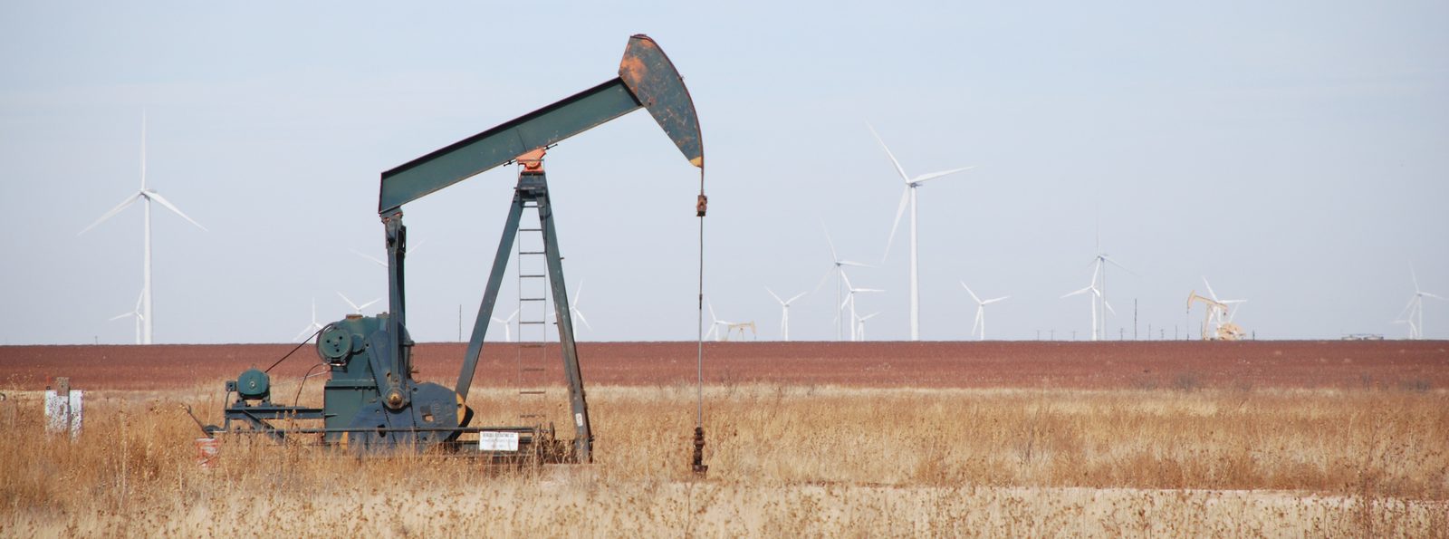
An oil pump dominates the foreground, while wind makes a visible presence in the background. Photo credit: Tom Murphy
7. The Energy Landscape
Now that we have a handle on common energy units and thermal processes, we can take a look at various sources of energy data and make sense of the information, allowing meaningful cross-comparisons. In this chapter, we will do exactly that, gaining in the process a perspective on the past and present roles different energy sources play at a national and global level.
Most of the information in this chapter comes from the U.S. Energy Information Administration’s (EIA’s) Annual Energy Review [34], and from a compilation of global data owing to Vaclav Smil and the British Petroleum Statistical Review of World Energy [16]. Rather than laboriously citing each instance, it is sufficient to assume for this chapter that numbers for the U.S. come from the former and global numbers come from the latter, unless stated otherwise.
7.1 The Annual Energy Review
Until 2011, the Annual Energy Review (AER) was compiled for the U.S. as an annual report. Since then, a web interface provides access to many of the same products, but not as a single document. An impressive amount of detail is available in the AER products, and we will only scratch the surface in this book, looking at high-level overviews. Later chapters will sometimes rely on deeper information to provide state-by-state use of hydroelectric, solar, wind, etc. But for now, we stick mostly to section 1 of the Annual Energy Review (AER), labeled Energy Overview.
7.1.1 Energy Flow
Section 1.0 of the AER is a one-page PDF graphic that conveys at a glance the flow of energy into and out of the U.S. Figure 7.1 shows the 2018 version.
![The flow of energy in the U.S. for 2018, as presented in [34]. Units are quadrillions of Btu (qBtu), unfortunately. From U.S. EIA.](/EnergyAndHumanAmbitions/build/fig-7-1-e5c36c387ee680f4a83860e1f2723c88.svg)
Figure 7.1:The flow of energy in the U.S. for 2018, as presented in [34]. Units are quadrillions of Btu (qBtu), unfortunately. From U.S. EIA.
From past experience, many students dislike this graphic. Firstly, it’s a product of the EIA, and not a creation of this book. Secondly, it is actually not so bad, once you get the hang of it.
Resources come in from the left. Expenditures or exports go off to the right. The format guarantees that all inputs must match all outputs.[1] We also see at a glance the big players vs. small players.
To understand, let’s start in the middle section. To the left of center, we see that the total supply sums to 122.44 qBtu. Of this, we consume 101.25 qBtu (right of center) and export the remaining 21.19 qBtu. Now we focus on the central column to get a powerful visual and quantitative snapshot of how our energy is partitioned.[2] From this, we see that 13% is coal, 31% is natural gas, 36.5% is petroleum (oil), 8% is nuclear energy, and 11.5% is renewable energy.[3]
Now the right-hand side shows the sectors into which the energy flows, finding roughly equal distribution between residential (homes), commercial (businesses), industrial (manufacture), and transportation (both personal and commercial/shipping). In this graphic, we lose entirely any sense for how much of each energy source contributes to each sector,[4] but that is coming in the next section.
Finally, the left-hand side indicates the inputs, grouped as domestic fossil fuel supply at top (out of our own ground), nuclear energy and renewable in the middle, and imports at bottom. From this, we can learn that we export some coal,[5] that almost all of our natural gas and 100% of our nuclear is domestic, and that 62% of our petroleum comes from domestic crude oil production.
Other insights are present in the graphic as well. Don’t be afraid to subtract or divide numbers to aid new discoveries.
7.1.2 Source and Sector
Figure 7.2 provides a more detailed breakdown of how energy flows from source to usage sectors.[9] In other words out of the 101.25 qBtu consumed in 2018, we see how much comes from each source, and within each source can track how much goes to each end-use category. For example, we learn that 91% of coal and 100% of nuclear go to electricity, and that 92% of transportation is based on petroleum.
Notice the black and gray block at lower center, representing electricity. We derive electricity from all the sources on the left, and electricity is consumed in all sectors. Also, of the 38.3 qBtu going into making electricity, only 13.0 qBtu (34%) makes it out the door as electricity, due to thermodynamic losses that were covered in Chapter 6.
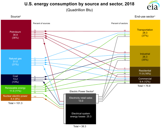
Figure 7.2:Tracking of energy sources and end-use in the U.S. for 2018, from section 2.0 of the AER. Small numbers beside the blocks represent percentages. Numbers that are not percentages are qBtu (quads). From U.S. EIA.
In principle, it is possible (and would be nice) to put percentages where the arrows enter and exit the electricity sector, but enough numbers are present to work this out, as Example 7.1.1 demonstrates. Without these numbers, the story is a little misleading. For instance, only 17% of natural gas goes directly to residential use, but some natural gas produces electricity, which then flows to residences. It is therefore not immediately obvious what percentage of residential energy ultimately comes from natural gas, but it’s more than the 43% indicated in the figure.
A similar graphic combining some elements of both Figure 7.1 and Figure 7.2 is provided by Lawrence Livermore National Lab [35].[10]
Table 7.1:U.S. energy consumption for 2018 in thermal equivalent terms.
| Resource | qBtu |
|---|---|
| Petroleum | 36.88 |
| Natural Gas | 31.09 |
| Coal | 13.25 |
| Nuclear | 8.44 |
| Biomass | 4.98 |
| Hydroelectric | 2.77 |
| Wind | 2.48 |
| Solar | 0.92 |
| Geothermal | 0.21 |
| Total | 101.0 |
7.1.3 Detailed Mix
Delving a bit further into the AER, Section 1.3 provides a more detailed breakdown of consumption, now separating out the “renewable” category into its constituent parts, as seen in Table 7.1 and Figure 7.3.
In sum, 80% of the U.S. energy in 2018 came from fossil fuels. Less than 2.5% came from wind, and less than 1% was solar in origin—the other 16% mainly in the form of nuclear, biomass, and hydroelectricity. Most of the renewable energy is from biomass—like burning wood. The wider world is pretty similar, in that about 80% of energy is from fossil fuels. It’s still our main squeeze. Table 7.2 breaks out electricity sources separately.
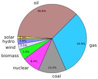
Figure 7.3:2018 Energy sources for the U.S. Figure 7.6 shows the global distribution.
Table 7.2:Percentages of electricity derived from various sources in the U.S. and globally in 2018. Bio includes burning wood and waste, and Geo means geothermal. Data are from Table 7.2a of [34] and from [37].
| Region | Coal | Gas | Oil | Nuclear | Hydro | Wind | Solar | Bio | Geo |
|---|---|---|---|---|---|---|---|---|---|
| U.S. | 27.3 | 34.9 | 0.6 | 19.2 | 7.0 | 6.5 | 2.3 | 1.5 | 0.4 |
| World | 38.0 | 23.0 | 2.9 | 10.1 | 16.2 | 4.8 | 2.1 | 2.4 | 0.5 |
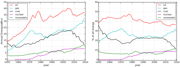
Figure 7.4:Recent history of primary energy consumption in the U.S. The three fossil fuels and nuclear are shown separately, and then all renewable sources are grouped together. Note that at the end of the plot, coal has sunk into a tie with renewable resources. The plot on the right shows percentages of total energy. Most of the lines are fairly flat, although in recent years the main story is gas replacing coal.
7.1.4 Energy Trends
It is worth looking at trends to understand not only the state of affairs today, but what happened over past decades and trends that may carry into the near future. Section 1.3 of the AER includes data going back to 1950 on the categories in Table 7.1.
Figure 7.4 shows the trends for the fossil fuels over the last 70 years, along with the slow rise of the sub-dominant non-fossil sources. Recent news touted the fact that the renewable sources[17] surpassed coal as an energy source in the U.S. Indeed, the lines basically meet on the
right-hand side of the plot, and the trends suggest a clear reversal of rank going forward. Note, however, that this result is largely due to natural gas replacing coal at electrical power plants. The sharp rise in natural gas nearly mirrors the decline in coal, while the rise in renewable resources is more modest. So this is really more a story of trading gas for coal than renewables replacing coal. Figure 7.4 also shows each source as a percentage of all energy. For a few decades (1980–2010), coal and gas were essentially tied, while oil sat at almost double these two. Lately, gas is approaching oil while coal plummets.
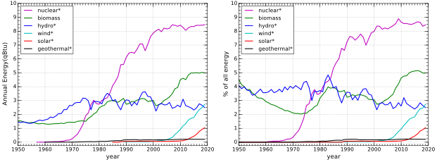
Figure 7.5:Recent history of non-fossil energy consumption in the U.S. Nuclear, hydroelectric, and biomass have dominated, while wind and solar are rising to join as players. Asterisks indicate thermal equivalents, as described in Box 7.2. The same data are plotted at right as a percentage of total energy. Aside from the rapid rise of nuclear in the middle years of the plot, the recent entry of wind and solar (though
still only a few percent) are the most interesting developments.
The non-fossil consumption in Figure 7.5 clarifies the breakdown of the “renewables” curve in Figure 7.4, alongside nuclear. From this, we see that nuclear dominates non-fossil energy, rising quickly from 1970 to 2000 and holding steady since then. Hydroelectric has been pretty stable over the last 50 years as other sources surpass it and lower its rank. The surge in biofuels around 1980 appears to be largely driven by increased burning of wood, while the next surge (2000–2010) was due to biofuels—mostly ethanol. Wind is approaching a 3% contribution to our total qBtu consumption budget, edging up about 0.2% per year. Solar is also on the move, reaching the 1% level recently and rising more slowly than wind. Geothermal is and will continue to be a paltry contributor.
7.2 Global Energy
Not surprisingly, the global story is not dramatically different from the story in the U.S., as Figure 7.6 and Figure 7.7 show. Fossil fuels dominate, with oil at the top. Coal has held a lead over natural gas in the wider world, unlike the U.S. Also, while nuclear and renewables are
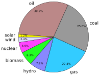
Figure 7.6:2018 Energy sources for the world. Figure 7.3 shows the U.S.
comparable in the U.S., this is not true globally, for reasons discussed shortly. Note that different assessments of global energy may report different percentage contributions depending on whether or not thermal equivalents are used (see Box 7.2).
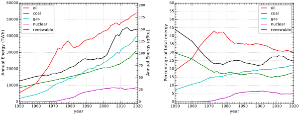
Figure 7.7:Recent history of primary energy consumption in the world. The three fossil fuels and nuclear are shown separately, while renewable sources are grouped together. The plot on the right shows the same data as a percentage of the whole.
For non-fossil contributions, Figure 7.8 shows the evolution of recent decades. Here, we see that a large part of the reason why renewables exceed nuclear energy globally is because of biomass. This makes sense, as countries having a lower standard of living are more likely to burn wood and less likely to have nuclear power.
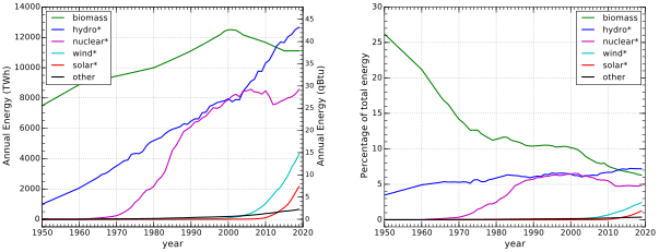
Figure 7.8:Recent history of non-fossil global energy consumption. Asterisks indicate thermal equivalents, as described in Box 7.2. The plot at right shows each source as a percentage of the total energy. Biomass accounted for a quarter of global energy in 1950.
7.2.1 U.S. Global Share
A final overview to help frame a number of discussions in this textbook looks at the U.S. share of consumption of various energy resources compared to the global total. The evolution seen on the left side of Figure 7.9 contains a crucial insight into geopolitics. In 1950, the U.S. used an astounding 84% of global natural gas and 72% of petroleum. At only 6% of the world’s population at the time, Americans used more than ten times the global average oil and gas, and substantially more than the rest of the world combined. Since energy per year is the definition of power, we can understand how the U.S. was a literal superpower during this era. Parroting Bill Clinton: It’s the resources, stupid.
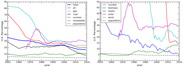
Figure 7.9:The left figure combines Figure 7.4 and Figure 7.7 to show the percentage of energy resources consumed by the U.S. over time. The overall picture is of a world catching up to an early leader. The U.S. was a literal “superpower” in the middle of the twentieth century. The dashed line at bottom represents the fraction of U.S. population in the world, so that energy use above this line means a greater-than-average share, which is true for all sources. The plot at right combines Figure 7.5 and Figure 7.8 to show the percentage of renewable and nuclear energy resources consumed by the U.S. over time. Solar and wind are characteristic of a nation known for
innovation: first on the scene.
The thicker dark blue line in the left panel of Figure 7.9 represents all sources of energy, combined. Around 1950, Americans used a third of all the global energy, corresponding to almost 8 times the global
average per non-American. Today, the ratio is closer to 4.
The right side of Figure 7.9 similarly explores U.S. share of renewables. The only up-trending resource is biomass, due to mandates for ethanol usage.[18] But it is a minor player in the scheme of things. Solar and wind are interesting, in that the U.S. initially held a large global share as pioneers of the technology before the rest of the world joined in.
7.3 Upshot: Go to the Source
The purpose of this chapter was twofold: first to introduce students to sources of reliable information on national and global energy production; and second to communicate the landscape of energy use. What emerges is a picture of a world still firmly in the grip of fossil fuels, whose annual usage continues to increase. Wind and solar are making inroads, but only at the few-percent levels thus far. The U.S. has played an outsized role in global energy relative to its population, especially in the mid-twentieth century.
7.4 Problems
Referring to Figure 7.1 and Figure 7.2, figure out the following measures:
a) What percentage of energy consumption in the U.S. is from petroleum?
b) What percentage of transportation is powered by petroleum? c) What percentage of petroleum goes directly to transportation? d) What percentage of petroleum goes directly to industrial processes (ignoring via electricity)?
The electricity block at the bottom center of Figure 7.2 is said to be 38.3 qBtu in size. Using the qBtu numbers in the sources at left, and the percentages of each going to electricity, figure out how many qBtu each line connecting to the left side of the electricity block represents.[19] What is the total, and does it match the 38.3 qBtu expectation, within reasonable rounding errors?
Building off the result in Problem 2, calculate the percentages[20] of contributions coming into the left side of the electricity block in Figure 7.2? Which is the dominant input?
Following a similar approach as for Problem 2,[21] concentrate on the output side of electricity production[22] and figure out how many qBtu are delivered to each sector on the right-hand side of the figure, based on input percentages to each of the four sectors
and their total qBtu amounts. Treat “” as 0.5%. Do these add to 13 qBtu, as they should, within rounding error?[23]
Figure 7.2 hides contributions of sources to end sectors behind the “electric black box.”[24] Following similar logic to that in the margin, and using results from Problem 4, figure out “corrected” values for what percentage of coal provides energy to each of the four end-sectors (re-distributing the 91% going to electricity into end-sectors).[25]
Figure 7.2 makes it look as if residential demand is satisfied without coal or nuclear, but 42% of residential demand comes from electricity, which does depend in part on coal and nuclear. Using numbers derived in Problem 3, and following a logic similar to that in Problem 5 and Example 7.1.1, redistribute this 42% residential contribution from electricity into its primary sources to ascertain what fraction of residential demand comes from each of the five source categories. For instance, petroleum would be the direct 8% plus 42% times the fraction (or percentage) of electricity coming from petroleum.[26]
While no energy source is free of environmental harm, arguably the last four entries in Table 7.1 are the cleanest, requiring no burning and no evidently problematic “waste.” What percentage of the total U.S. energy is in this “clean” form, at present?
Let’s say that in the course of one year a county in Texas produces 5 million kWh of electrical output from wind, and also pumps 100,000 barrels of oil from the ground containing a (thermal) energy content of about 6 GJ per barrel. What percentage of total energy production came from wind, if scaling wind in terms of thermal equivalent, as explained in Box 7.2?
Referring to Figure 7.4, what is the fastest-growing energy source in the U.S., and is it one of the fossil fuels?
If the approximately linear trends for recent increases in solar and wind seen in Figure 7.5 were to continue at the current (linear) pace, approximately how long would it take for the pair of them to cover our current qBtu per year demand?[27]
If the downward trend in U.S. coal use continues at its current pace, approximately what year would we hit zero?
Globally, do any of the resources appear to be phasing out, as coal is in the U.S. (as in Problem 11)? If so, how long before we would expect to reach zero usage, globally, based on simple extrapolation?
Globally, would you say that renewable energy sources are climbing faster than the combined fossil fuels, or more slowly? Can we therefore confidently project a time when renewables will overtake fossil fuels, based on trends to date?
As explored in Problem 11, the U.S. usage of coal is falling precipitously. According to the left plot in Figure 7.9, is the U.S. usage of coal greater or less than the global per-capita average?
Is the U.S. per-capita usage of any energy source lower than the global average, according to Figure 7.9?
That is, no significant amount of energy is stored or drawn from a stockpile.
By luck, total consumption is very nearly 100 qBtu, so the amount of each source in qBtu is already approximately a percentage!
Think of the three forms of fossil fuels as solid (coal), liquid (petroleum/oil) and gas (natural gas; not the same as liquid gasoline, which is a petroleum product).
For instance, we cannot tell how much coal is used in the industrial sector.
For instance, the supply of 15.33 qBtu that is mined is larger than the 13.24 qBtu we consume.
Neat trick: roughly seconds in a year.
American energy usage is much higher than average because of consumerism, diet, comfort standards, prevalence of detached housing, and transportation.
Notice that the source and end-use numbers in the boxes match the numbers in Figure 7.1 within rounding error.
As a check, we note that the other side of the blue arrow has 17% of 31.0 qBtu, or 5.3 qBtu leaves the gas block for homes: close enough to the 5.1 qBtu we got on the other side (essentially the same, to rounding error).
35% of 31.0 qBtu
Wouldn’t it be nice if Figure 7.2 printed a blue 28 where the blue arrow comes into the electricity block?
13.0 qBtu of electricity is produced from 38.3 qBtu energy input.
… averaging the two estimates from before
The actual factor is just the inverse of the electrical conversion efficiency discussed above (34%, so . The conversion efficiency adopted by the EIA has slowly increased over time, and is tracked in Appendix A6 of the AER—now at 37.5%, leading to a conversion factor of 2.67.
The term “renewable,” will be more fully explained in Chapter 10.
More on biofuels in Chapter 14.
Example 7.1.1 may offer guidance.
Verifying that they add to 100% is a good check.
See also Example 7.1.1.
13.0 qBtu delivered; implying 34% conversion efficiency from primary sources to delivered electricity
This is a great way to check the correctness of your answers.
For example, the figure indicates that 17% of natural gas goes directly to residential end-users. But a substantial fraction of natural gas (35%) also goes to electricity, and 38.5% of electrical output goes toward residential use—a result of Problem 4. So the fraction of natural gas ending up satisfying residential demands is the direct 17% plus 38.5% of 35%, adding to 30.5%.
The four numbers you get should add to 100%, within rounding error.
Make sure your five numbers add to 100%, within rounding error.
We can hope to see faster-than-linear expansion in renewables, but this question asks what would happen without dramatic changes to the recent trends.