
Photo Credit: Tom Murphy
3. Population
Underlying virtually every concern relating to our experience on this planet is the story of human population. The discussion of continued energy growth in Chapter 1 was based on the historical growth rate of energy, which is partly due to growing population and partly due to increased use per capita. But the notion that population will continue an exponential climb, as is implicit in the Chapter 1 scenario, is impractical— one of many factors that will render the “predictions” of Chapter 1 invalid and prohibit “growth forever.”
So let’s add a dose of reality and examine a more practical scenario. Americans’ per-capita use of energy is roughly five times the global average rate. If global population eventually doubles, and the average global citizen advances to use energy at the rate Americans currently do,[1] then the total scale of energy use would go up by a factor of 10, which would take 100 years at our mathematically convenient 2.3% annual rate (see Eq. 1.5; p. 6). This puts a more realistic—and proximate— timescale on the end of energy growth than the fantastical extrapolations of Chapter 1.
Although the focus of this chapter will be on the alarming rate of population growth, we should keep the energy and resource context in mind in light of the overall theme of this book. To this end, Figure 3.1 shows the degree to which energy demand has outpaced population growth, when scaled vertically to overlap in the nineteenth century. From 1900 to 1950, per-capita energy consumption increased modestly, but then ballooned dramatically after 1950, so that today we have the equivalent of 25 billion people on the planet operating at nineteenth century energy levels.
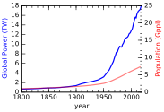
Figure 3.1:Population (red) and energy demand (blue) on the same plot, showing how much faster energy demand (power) has risen compared to population, which translates to increasing per-capita usage. The vertical axes are scaled so that the curves overlap in the nineteenth century. [14–16].
Since population plays a giant role in our future trajectory, we need to better understand its past. We can also gain some sense for theoretical
expectations, then discuss the heralded “demographic transition” and its implications.
3.1 Population History
Figure 3.2 shows a history of global population for the last 12,000 years. Notice that for most of this time, the level is so far down as to be essentially invisible. It is natural to be alarmed by the sharp rise in recent times, which makes the current era seem wholly unusual: an aberration. But wait—maybe it’s just a plain exponential function. All exponential functions—ruthless as they are—would show this alarming rise at some point, sometimes called a “hockey stick” plot. In order to peer deeper, we plot population on a logarithmic vertical axis (Figure 3.3). Now we bring the past into view, and can see whether a single exponential function (which would have a constant slope in a logarithmic plot) captures the story.
![Global population estimate, over the modern human era, on a linear scale. Figure 3.1 offers a recent close-up. [14, 15].](/EnergyAndHumanAmbitions/build/fig-3-2-43fd37564c1580bfc5380cd6f2de6274.svg)
Figure 3.2:Global population estimate, over the modern human era, on a linear scale. Figure 3.1 offers a recent close-up. [14, 15].
Wait, what? It still looks somewhat like a hockey stick (even more literally so)! How can that be?! This can’t be good news. Peering more closely, we can crudely break the history into two eras, each following exponential growth (straight lines on the plot), but at different rates. The early phase had a modest 0.044% growth rate. By the “rule of 70,” the corresponding doubling time is about 1,600 years. In more recent times, a 1% rate is more characteristic (70 year doubling). Indeed, we would be justified in saying that recent centuries are anomalous compared to the first 10,000 years of the plot. If we extend the the 0.04% line and the 1% line, we find that they intersect around the year 1700, which helps identify the era of marked transition.
![Global population estimate, over the modern human era, on a logarithmic scale. [14, 15].](/EnergyAndHumanAmbitions/build/fig-3-3-72e2219646110eb0407f92effd7f1b02.svg)
Figure 3.3:Global population estimate, over the modern human era, on a logarithmic scale. [14, 15].
The recent rapid rise is a fascinating development, and begs for a closer look. Figure 3.4 shows the last years, for which we see several exponential-looking segments at ever-increasing rates. The doubling times associated with the four rates shown on the plot are presented in Table 3.1.
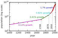
Figure 3.4:Global population estimate, over recent centuries. On the logarithmic plot, lines of constant slope are exponential in behavior. Four such exponential segments can be broken out in the plot, having increasing growth rates. [14, 15].
An interpretation of the population history might go as follows. Not much changed during the period following the Dark Ages.[2] The Renaissance introduced scientific thinking so that we began to conquer diseases, allowing an uptick in population growth. In the mid-19th century , the explosive expansion of fossil fuel usage permitted industrialization at a large scale, and mechanized farming practices. More people could be fed and supported, while our mastery over human health continued to improve. In the mid-20th century , the Green Revolution [17] introduced a fossil-fuel-heavy diet of fertilizer and large-scale mechanization of agriculture, turning food production into an industry. The combination of a qualitative change in the availability of cheap nutrition and the march of progress on disease control cranked the population rate even higher.
Table 3.1:Doubling times for Fig. 3.4.
| Years | % growth | |
|---|---|---|
| 1000–1700 | 0.12% | 600 yr |
| 1700–1870 | 0.41% | 170 yr |
| 1870–1950 | 0.82% | 85 yr |
| 1950–2020 | 1.70% | 40 yr |
In more recent years, the rate has fallen somewhat from the 1.7% fit of the last segment in Figure 3.4, to around 1.1%. Rounding down for convenience, continuation at a 1% rate would increase population from 7 billion to 8 billion people in less than 14 years. The math is the same as in Chapter 1, re-expressed here as
where is the population at time , and is the population at time if the growth rate is steady at . Inverting this equation,[3] we have
Table 3.2:Population milestones: dates at which we added another one billion living people to the planet. The Time and Doubling columns are expressed in years. Around 1965, the growth rate got up to 2%, for a 35 year doubling time.
| Year | Population | Time | Rate | Doubling |
|---|---|---|---|---|
| 1804 | 1 Gppl | — | 0.4% | 170 |
| 1927 | 2 Gppl | 123 | 0.8% | 85 |
| 1960 | 3 Gppl | 33 | 1.9% | 37 |
| 1974 | 4 Gppl | 14 | 1.9% | 37 |
| 1987 | 5 Gppl | 13 | 1.8% | 39 |
| 1999 | 6 Gppl | 12 | 1.3% | 54 |
| 2011 | 7 Gppl | 12 | 1.2% | 59 |
| 2023 | 8 Gppl | 12 | 1.1% | 66 |
Table 3.2 and Figure 3.5 illustrate how long it has taken to add each billion people, extrapolating to the 8 billion mark (as of writing in 2020). The first billion people obviously took tens of thousands of years, each new billion people taking less time ever since. Growth rate peaked in the 1960s at 2% and a doubling time of 35 years. The exponential rate is moderating now, but even 1% growth continues to add a billion people every 13 years, at this stage. A famous book by Paul Ehrlich called The Population Bomb [18], first published in 1968, expressed understandable alarm at the 2% rate that had only increased to that point. The moderation to 1% since that period is reassuring, but we are not at all out of the woods yet. The next section addresses natural mechanisms for curbing growth.
![Graphical representation of Table 3.2, showing the time between each billion people added [14, 15].](/EnergyAndHumanAmbitions/build/fig-3-5-4e50227899a2944452fef39a790e5d81.svg)
Figure 3.5:Graphical representation of Table 3.2, showing the time between each billion people added [14, 15].
3.2 Logistic Model
Absent human influence, the population of a particular animal species on the planet might fluctuate on short timescales (year by year) and experience large changes on very long timescales (centuries or longer). But by-and-large nature finds a rough equilibrium. Overpopulation proves to be temporary, as exhaustion of food resources, increased predation, and in some cases disease (another form of predation, really) knock back the population.[5] On the other hand, a small population finds it easy to expand into abundant food opportunities, and predators reliant on the species have also scaled back due to lack of prey.
We have just described a form of negative feedback: corrective action to remedy a maladjusted system back toward equilibrium.
We can make a simple model for how a population might evolve in an environment hosting negative feedback. When a population is small and resources are abundant, the birth rate is proportional to the population.
If the setup in Example 3.2.1 were the only element to the story, we would find exponential growth: more offspring means a larger population, which ultimately reaches breeding age to produce an even larger population.[7] But as the population grows, negative feedback will begin to play a role. We will denote the population as , and its rate of change as .[8] We might say that the growth rate, or , is
where represents the birth rate in proportion to the population (e.g., 0.04 if 4% of the population will give birth in a year).[9] This equation just re-iterates the simple idea that the rate of population growth is dependent on (proportional to) the present population. The solution to this differential equation is an exponential:
which is really just a repeat of Eq. 3.1, where takes the place of .
Let’s say that a given forest can support an ultimate number of deer, labeled , in steady state, while the current population is labeled . The difference, is the “room” available for growth, which we might think of as being tied to available resources. Once , no more resources are available to support growth.
quantifies a growth-limiting mechanism by representing available room. One way to incorporate this feature into our growth rate equation is to make the rate of growth look like
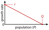
Figure 3.6:The rate of growth in the logistic model decreases as population increases, starting out at when and reaching zero as (see Eq. 3.5).
We have multiplied the original rate of by a term that changes the effective growth rate . When is small relative to , the effective rate is essentially the original . But the effective growth rate approaches zero as approaches . In other words, growth slows down and hits zero when the population reaches its final saturation point, as (see Figure 3.6).
The mathematical solution to this modified differential equation (whose solution technique is beyond the scope of this course) is called a logistic curve, plotted in Figure 3.7 and having the form
The first part of the curve in Figure 3.7, for very negative values[11] of , is exponential but still small. At (time of inflection), the population is . As time marches forward into positive territory, approaches . As it does so, negative feedback mechanisms (limits to resource/food availability, predation, disease) become more assertive
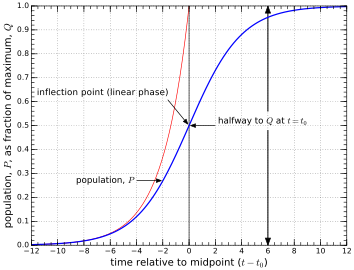
Figure 3.7:Logistic population curve (blue), sometimes called an S-curve, as given in Eq. 3.6, in this case plotting for to match examples in the text. The red curve is the exponential that would result without any negative feedback.
and suppress the rate of growth until it stops growing altogether when reaches .
The logistic curve is the dream scenario: no drama. The population simply approaches its ultimate value smoothly, in a tidy manner. We might imagine or hope that human population follows a similar path. Maybe the fact that we’ve hit a linear phase—consistently adding one billion people every 12 years, lately—is a sign that we are at the inflection, and will start rolling over toward a stable endpoint. If so, we know from the logistic curve that the linear part is halfway to the final population.
3.2.1 Overshoot
But not so fast. We left out a crucial piece: feedback delay. The math that leads to the logistic curve assumes that the negative feedback[14] acts instantaneously in determining population rates.
Consider that human decisions to procreate are based on present conditions: food, opportunities, stability, etc. But humans live for many decades, and do not impose their full toll on the system until many years after birth, effectively delaying the negative feedback. The logistic curve and equation that guided it had no delay built in.
This is a pretty easy concept to understand. The logistic curve of Figure 3.7 first accelerates, then briefly coasts before decelerating to arrive smoothly at a target. Following an example from [1], it is much like a car starting from rest by accelerating before applying the brakes to gently come to a stop when the bumper barely kisses a brick wall. The driver is operating a negative feedback loop: seeing/sensing the proximity to the wall and slowing down accordingly. The closer to the wall, the slower the driver goes until lightly touching the wall. Now imagine delaying the feedback to the driver by applying a blindfold and giving voice descriptions of the proximity to the wall, so that decisions about how much to brake are based on conditions from a delayed communication process. Obviously, the driver will crash into the wall if the feedback is delayed, unless slowing down the whole process dramatically. Likewise, if the negative consequences—signals that we need to slow down population growth—arrive decades after the act of producing more humans, we can expect to exceed the “natural” limit, —a condition called overshoot.
We can explore what happens to our logistic curve if the negative feedback is delayed by various amounts. Figure 3.8 gives a few examples of overshoot as the delay increases. To avoid significant overshoot, the delay needs to be smaller than the natural timescale governing the problem: , where is the rate in Eqs. 3.5 and 3.6. In our deer example using , any delay longer than about 2 years causes overshoot. For more modest growth rates (human populations), relevant delays are in decades (see Box 3.1).
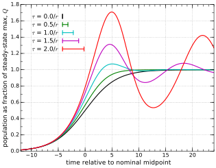
Figure 3.8:Feedback delay generally results in overshoot and oscillation, shown for various delay values, . The black curve is the nominal no-delay logistic curve. As the delay increases, the severity of overshoot increases. Delays are explored in increments of 0.5 times the characteristic timescale of (using here to match previous examples, so that a delay of equates to 3 time units on the graph, for instance). The delay durations are also indicated by bar lengths in the legend.
Eventually all the curves in Figure 3.8 converge to the steady state value of 1.0,[15] but human population involves complexities not captured in this bare-bones mathematical model.[16] All the same, the generic phenomenon of overshooting when negative feedback is delayed is a robust attribute, even if the oscillation and eventual settling does not capture the future of human population well.
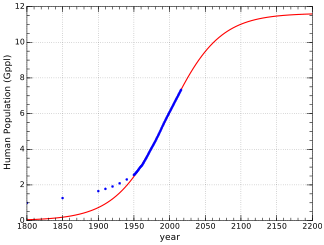
Figure 3.9:Human population data points (blue) and a logistic curve (red) that represents the best fit to data points from 1950 onward. The resulting logistic function has Gppl, , and a midpoint at the year 1997. The actual data sequence has a sudden bend at 1950 (Green Revolution?) that prevents a suitable fit to a larger span of data. In other words, the actual data do not follow a single logistic function very well, which is to be expected when conditions change suddenly (energy and technology, in this case) [14, 15].
3.2.2 Logistic Projection
As suggested by Figure 3.9, Human population is not following a strict logistic curve. If it were, the early period would look exponential at the rate corresponding to the best-fit logistic matching our recent trajectory, but growth was substantially slower than 2.8% in the past. Technology and fossil fuels have boosted our recent growth well beyond the sub-percent rates typical before . The point is that while reference to mathematical models can be extremely helpful in framing our thinking and exposing robust, generic modes of interest, we should seldom take any mathematical model literally, as it likely does not capture the full complexity of the system it is trying to model. In the present case, it is enough to note that:
exponentials relentlessly drive toward infinity (ultimately unrealistic);
logistic curves add a sensible layer of reality, capping growth in some steady-state outcome;
other dynamical factors such as delays can prevent a smooth logistic function, possibly leading to overshoot; and
many other factors (medical and technological breakthroughs, war, famine, climate change) can muddy the waters in ways that could make the situation better or worse than simple projections.
3.3 Demographic Transition
Perhaps not surprisingly, the rate of a country’s population growth is correlated to its wealth, as seen in Figure 3.10. An attractive path to reducing population growth would be to have poor countries slide down this curve to the right: becoming more affluent and transforming societal values and pressures accordingly to produce a lower net population growth rate.
Population growth happens when the birth rate exceeds the death rate.
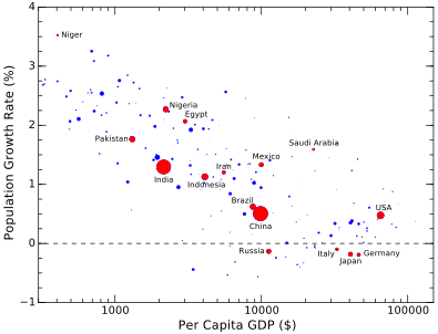
Figure 3.10:Net population rate, in percent, as a function of per-capita GDP. A clear trend shows wealthier countries having lower growth rates. A win–win solution would seem to present itself, in which everyone arrives at the lower right-hand side of this graph: more money for all and a stable population! Dot size (area) is proportional to population [6, 8, 19, 20].
As conditions change, birth and death rates need not change in lock-step. Developed countries tend to have low birth rates and low death rates, balancing to a relatively low net population growth rate. Developing countries tend to have high death rates and even higher birth rates, leading to large net growth rates. Figure 3.11 depicts both birth rates and death rates for the countries of the world. A few countries (mostly in Europe) have slipped below the replacement line, indicating declining population.[19]
The general sense is that developed countries have “made it” to a responsible low-growth condition, and that population growth is driven by poorer countries. An attractive solution to many[20] is to bring developing countries up to developed-country standards so that they, too, can settle into a low growth rate. This evolution from a fast-growing poor country to a slow (or zero) growth well-off country is called the demographic transition.
In order to accomplish this goal, reduced death rates are facilitated by
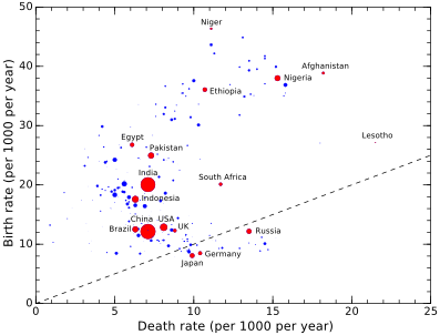
Figure 3.11:Birth rates and death rates for countries, where dot size is proportional to population. The diagonal line indicates parity between birth and death rates, resulting in no population growth. Countries above the line are growing population, while countries below are shrinking. A few countries fall a bit below this line [8, 19, 20].
introducing modern medicine and health services to the population. Reduced birth rates are partly in response to reduced infant mortality— eventually leading to fewer children as survival is more guaranteed. But also important is better education—especially among women in the society who are more likely to have jobs and be empowered to exercise control of their reproduction (e.g., more say in relationships and/or use of contraception). All of these developments take time and substantial financial investment.[21] Also, the economy in general must be able to support a larger and better-educated workforce. The demographic transition is envisioned as a transformation or complete overhaul, resulting in a country more in the mold of a “first-world” country.[22]
Figure 3.11 hints at the narrative. Countries are spread into an arc, one segment occupying a band between 5–10 deaths per 1,000 people per year and birth rates lower than 20 per 1,000 people per year. Another set of countries (many of which are in Africa) have birth rates above 20 per 1,000 per year, but also show higher death rates. The narrative arc is that a country may start near Lesotho, at high death and birth rates, then migrate over toward Nigeria as death rates fall (and birth rates experience a temporary surge). Next both death and birth rates fall and run through a progression toward Pakistan, India, the U.S., and finally the European steady state. Figure 3.12 schematically illustrates the typical journey.
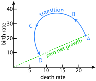
Figure 3.12:Schematic of how the demographic transition may play out in the space plotted in Figure 3.11. At points A and D, birth rates and death rates are equal, resulting in no population growth. Typically, death rates decline while birth rates increase (point B), and eventually death rates reach a floor while birth rates begin to fall (at C).
The demographic transition receives widespread advocacy among Western intellectuals for its adoption, often coupled with the sentiment that it can’t come soon enough. Indeed, the humanitarian consequences appear to be positive and substantial: fewer people living in poverty and hunger; empowered women; better education; more advanced jobs; and greater tolerance in the society. It might even seem condemnable not to wish for these things for all people on Earth.
However, we need to understand the consequences. Just because we want something does not mean nature will comply. Do we have the resources to accomplish this goal? If we fail in pursuit of a global demographic transition, have we unwittingly unleashed even greater suffering on humanity by increasing the total number of people who can no longer be supported? It is possible that well-intentioned actions produce catastrophic results, so let us at least understand what is at stake. It may be condemnable not to wish for a global demographic transition, but failing to explore potential downsides may be equally ignoble.
3.3.1 Geographic Considerations
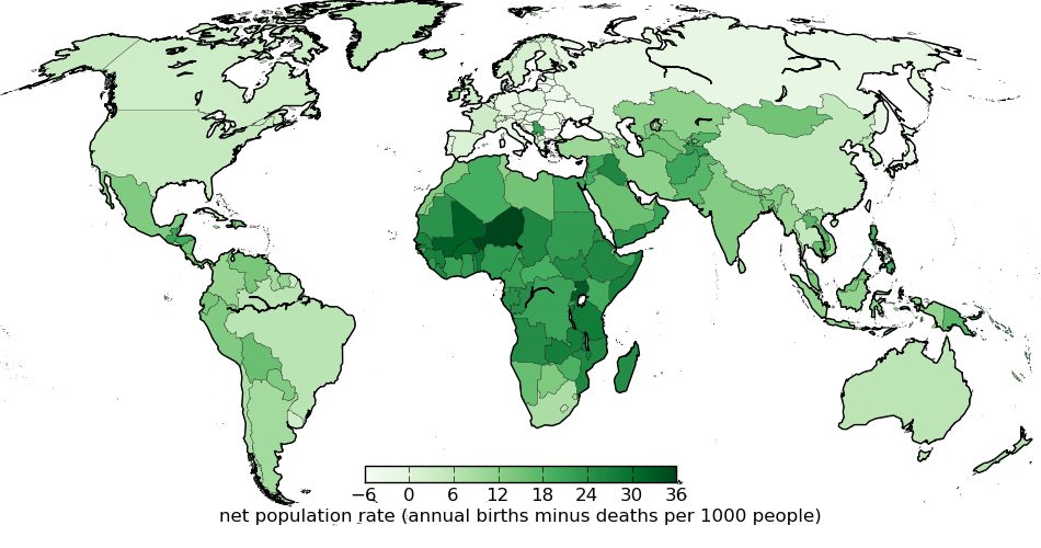
Figure 3.13:Net population growth rate by country: birth rate minus death rate per 1,000 people per year. The highest net growth (darkest shading) is Niger, in Saharan Africa [19, 20].
Figure 3.13 shows the net population rate (birth minus death rate) on a world map. Africa stands out as the continent having the largest net population growth rate, and has been the focus of much attention when discussing population dynamics.
But let us cast population rates in different countries in a new light. Referring to Figure 3.13, it is too easy to look at Niger’s net population rate—which is about ten times higher than that of the U.S. (see Example 3.3.1)—and conclude that countries similar to Niger present a greater risk to the planet in terms of population growth. However, our perspective changes when we consider absolute population levels. Who cares if a country’s growth rate is an explosive 10% if the population is only 73 people?[23]
Figure 3.14 multiplies the net rate by population to see which countries contribute the most net new people to the planet each year, and Table 3.3 lists the top ten. Africa no longer appears to be the most worrisome region in this light.[24] India is the largest people-producing country at present, adding almost 18 million per year. Far behind is China, in second
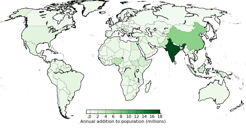
Figure 3.14:Absolute population growth rate by country: how many millions of people are added per year (birth rate minus death rate times population) [8, 19, 20].
place. The U.S. adds about 1.6 million per year, a little beyond the top ten. This exercise goes to show that context is important in evaluating data.
Table 3.3:Top ten populators [8, 19, 20], in terms of absolute number of people added to each country. Birth rates and death rates are presented as number per 1,000 people per year. These ten countries account for 55% of population growth worldwide.
| Country | Population (millions) | Birth Rate | Death Rate | Annual Millions Added |
|---|---|---|---|---|
| India | 1,366 | 20.0 | 7.1 | 17.7 |
| China | 1,434 | 12.1 | 7.1 | 7.2 |
| Nigeria | 201 | 38.0 | 15.3 | 4.6 |
| Pakistan | 216 | 24.9 | 7.3 | 3.8 |
| Indonesia | 271 | 17.6 | 6.3 | 3.1 |
| Ethiopia | 112 | 36.1 | 10.7 | 2.8 |
| Bangladesh | 163 | 20.2 | 5.6 | 2.3 |
| Philippines | 108 | 24.2 | 5.0 | 2.1 |
| Egypt | 100 | 26.8 | 6.1 | 2.1 |
| DR Congo | 87 | 36.9 | 15.8 | 1.8 |
| Whole World | 7,711 | 19.1 | 8.1 | 86 |
Adding another relevant perspective, when one considers that the per-capita energy consumption in the United States is more than 200 times that of Niger,[25] together with the larger U.S. population, we find that the resource impact from births is almost 400 times higher for the U.S. than for Niger.[26] On a per capita basis, a citizen of the U.S. places claims on future resources at a rate 28 times higher than a citizen of Niger via population growth.[27] On a finite planet, the main reason we care about population growth is in relation to limited resources. Thus from the resource point of view, the problem is not at all confined to the developing world. Table 3.4 indicates how rapidly the top ten countries are creating energy demand (as a proxy to resource demands in general) based on population growth alone. Figure 3.15 provides a graphical perspective of the same (for all countries). For reference, one gigawatt (GW) is the equivalent of a large-scale nuclear or coal-fired power plant. So China, the U.S., and India each add the equivalent of 10–20 such plants per year just to satisfy the demand created by population growth.[28]
Table 3.4:Top ten countries for growth in energy demand. Populations are in millions. Power is in Watts or 109 W (GW). The power added annually is the absolute increase in demand due to population growth, and is a proxy for resource demands in general. The last column provides some measure of an individual citizen’s share of the responsibility in terms of increasing pressure on resources. The top three contributors to new power demand via population growth alone (China, the U.S., and India) account for about a third of the global total. [7, 8, 19, 20]
| Country | Population | Annual Growth | Per Capita Power (W) | Power Added Annually (GW) | Power Added Per Citizen (W) |
|---|---|---|---|---|---|
| China | 1,434 | 7.2 | 2,800 | 20.2 | 14 |
| United States | 329 | 1.6 | 10,000 | 15.6 | 48 |
| India | 1,366 | 17.7 | 600 | 10.5 | 8 |
| Saudi Arabia | 34 | 0.54 | 10,100 | 5.5 | 160 |
| Iran | 83 | 1.0 | 4,300 | 4.3 | 52 |
| Mexico | 128 | 1.7 | 2,000 | 3.3 | 26 |
| Indonesia | 271 | 3.1 | 900 | 2.8 | 10 |
| Brazil | 211 | 1.3 | 2,000 | 2.7 | 13 |
| Egypt | 100 | 2.1 | 1,200 | 2.5 | 25 |
| Turkey | 83 | 0.85 | 2,100 | 1.8 | 21 |
| Whole World | 7,711 | 86 | 2,300 | 143 | 18.4 |
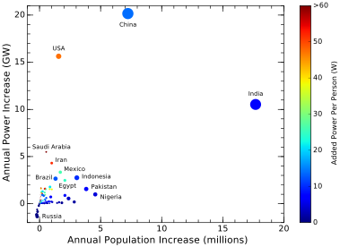
Figure 3.15:Graphical representation of Table 3.4, for all countries. Dots, whose size is proportional to population, indicate how many people are added per year, and how much additional energy demand is created as a consequence. Color indicates the added population-growth-driven power demand an individual citizen is responsible for generating each year as a member of the society. Negative cases (contracting) include Russia, Japan, Germany, and Ukraine [7, 8, 19, 20].
The last column in Table 3.4 is the per-citizen cost, meaning, for instance that each person in the U.S. adds about 50 Watts per year of energy demand via the country’s net population growth rate.[29] In this sense, the last column is a sort of “personal contribution” an individual makes to the world’s resource demands via net population rates and consumption rates in their society. Those having high scores should think twice about assigning blame externally, and should perhaps tend to their own house, as the saying goes.
Before departing this section, let us look at continent-scale regions rather than individual countries in terms of adding people and resource demands. Table 3.5 echoes similar information to that in Table 3.4, in modified form. What we learn from this table is that Asia’s demands are commensurate with their already-dominant population; North America creates the next largest pressure despite a much smaller population;
Table 3.5:Population pressures from regions of the world, ranked by added power demand. Some of the columns are expressed as percentages of the total. The bottom row has totals in millions of people or total GW in place of percentages. [7, 8, 19, 20]
| Country | Population (%) | Annual Growth (%) | Per Capita Power (W) | Power Added Annually (%) | Power Added Per Citizen (W) |
|---|---|---|---|---|---|
| Asia | 59.7 | 55.1 | 1,800 | 60.5 | 18.9 |
| N. America | 7.6 | 5.5 | 7,100 | 23.0 | 56.1 |
| Africa | 16.9 | 34.7 | 500 | 9.9 | 10.8 |
| S. America | 5.5 | 4.4 | 2,000 | 5.4 | 18.1 |
| Oceania | 0.5 | 0.5 | 5,400 | 1.5 | 49.5 |
| Europe | 9.7 | -0.1 | 4,900 | -0.3 | -0.6 |
| Whole World | 7,711 M | 86 M | 2,300 | 143 GW | 18.4 |
Africa is significant in terms of population growth, but constitutes only 10% of resource pressure at present. Finally, Europe holds 10% of the globe’s people but lays no claim on added resources via population growth, resembling the target end-state of the demographic transition.[30]
3.3.2 Cost of the Demographic Transition
A final point relates to the trajectory depicted in Figure 3.12 for demographic transitions: death rate decreases first while birth rates remain high—or rise even higher—before starting to come down. An example sequence is illustrated in Figure 3.16: initially the rates are high (at , and the same (resulting in steady population); then the death rate transitions to a new low rate over a time ; and the birth rate begins to fall some time later before matching the death rate and stabilizing population again. The yellow-shaded area between the curves indicates the region where birth rate exceeds death rate, leading to a net population growth (a surge in population).
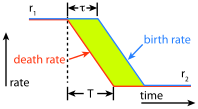
Figure 3.16:Schematic demographic transition time sequence.
The amount of growth in the surge turns out to be proportional to the exponential of the area between the curves. For this trapezoid cartoon, the area is just the base times the height (rate difference), so that the population increase looks like , where is the initial rate per year and is the final rate. The actual curves may take any number of forms, but the key point is that delayed onset of birth rate decrease introduces a population surge, and that magnitude of the surge grows as the area between the curves increases.
So to effect a demographic transition means to increase the population burden substantially. Meanwhile, the transitioned population consumes resources at a greater rate—a natural byproduct of running a more advanced society having better medical care, education, and employment opportunities. Transportation, manufacturing, and consumer activity all increase. The net effect is a double-whammy: the combined impact of a greater population using more resources per capita. The resource impact on the planet soars.
The pertinent question is whether the Earth is prepared to host a dramatic increase in resource usage. Just because we might find appealing the idea that all countries on Earth could make it through the demographic transition and live at a first-world standard does not mean nature has the capacity to comply. The U.S. per-capita energy usage is roughly five times the current global average. To bring 7 billion people to the same standard would require five times the current scale. Completion of a global demographic transition would roughly double the current world population so that the total increase in energy would be a factor of ten. The blue-dashed projection in Figure 3.17 looks rather absurd as an extension of the more modest—but still rather remarkable—energy climb to date. As we are straining to satisfy current energy demand, the “amazing dream” scenario seems unlikely to materialize.
Energy in this context is a proxy for other material resources. Consider the global-scale challenges we have introduced today: deforestation, fisheries collapse, water pressures, soil degradation, pollution, climate change, and species loss, for instance. What makes us think we can survive a global demographic transition leading to a consumption rate many times higher than that of today? Does it not seem that we are already approaching a breaking point?
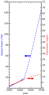
Figure 3.17:What our energy demand would have to do (blue-dashed line) if the growing global population (here projected as a red-dashed logistic curve) grew its per-capita energy consumption to current U.S. standards by the year 2100 (a factor-of-five increase). Historical energy and population are represented as solid curves. The departure from past reality would have to be staggering [15, 16].
If nature won’t let us realize a particular dream, then is it morally responsible to pursue it? This question becomes particularly acute if the very act of pursuing the dream increases the pressure on the system and makes failure even more likely. Total suffering might be maximized if the population builds to a point of collapse. In this sense, we cleverly stack the most possible people into the stadium to witness a most spectacular event: the stadium’s collapse—which only happened because we packed the stadium. You see the irony, right?
The drive to realize a global demographic transition is strong, for the obvious set of reasons discussed above (improved quality of life, educational opportunity, greater tolerance, dignity, and fulfillment). Challenging the vision may be an uphill battle, since awareness about resource limits is not prevalent. This may be an example of the natural human tendency to extrapolate: we have seen the benefits of the demographic transition in many countries over the last century, and may expect this trend to continue until all countries have completed the journey. But bear in mind that earlier successes transpired during times in which global resource availability was not a major limitation. If conditions change, and we reach a “full” earth, past examples may offer little relevant guidance.
3.4 Touchy Aspects
3.4.1 Population Discussions Quickly Get Personal
Some of the decisions we make that translate into impact on our physical world are deeply personal and very difficult to address. No one wants to be told what they should eat, how often they should shower, or what temperature they should keep their dwelling. But the touchiest of all can be reproduction. It can be tricky to discuss population concerns with someone who has kids. Even if not intentional, it is too easy for the topic to be perceived as a personal attack on their own choices. And we’re not talking about choices like what color socks to wear. Children are beloved by (most) parents, so the insinuation that having children is bad or damaging quickly gets tangled into a sense that their “angel” is being attacked—as is their “selfish” decision to have kids (see Box 3.2). The disconnect can be worse the larger the number of kids someone has. Couples having two kids take some solace in that they are exercising net-zero “replacement.”
One common side-step is to focus attention on the high birthrates in other countries, so that the perceived fault lies elsewhere. As pointed out above, if stress on the planet—and living within our means—is what concerns us, undeveloped countries are not putting as much pressure on global resources as many of the more affluent countries are. So while pointing elsewhere offers a bit of a relief, and is a very natural tendency, it does not get the whole picture.
The overall point is to be aware of the sensitive nature of this topic when discussing with others. Making someone feel bad about their choices— even if unintentionally—might in rare cases result in an appreciation and greater awareness. But it is more likely to alienate a person from an otherwise valuable perspective on the challenges we face.
3.4.2 Population Policy
What could governments and other organizations do to manage population? Again, this is touchy territory, inviting collision between deeply personal or religious views and the state. China initiated a one-child policy in 1979 that persisted until 2015 (exceptions were granted depending on location and gender). The population in China never stopped climbing during this period, as children born during prior periods of higher birth rates matured and began having children of their own—even if restricted in number. The population curve in China is not expected to flatten out until sometime in the 2030–2040 period.[32] Such top-down policies can only be enacted in strong authoritarian regimes, and would be seen as a severe infringement on personal liberties in many countries. Religious belief systems can also run counter to deliberate efforts to limit population growth. In addition, shrinking countries are at a competitive disadvantage in global markets, often leading to policies that incentivize having children.
One striking example of rarely-achieved sustainable population control comes from the South Pacific island of Tikopia [21]. Maintaining a stable population for a few thousand years on this small island involved not only adopting food practices as close to the island’s natural plants as possible, but also invoking strict population controls. The chiefs in this egalitarian society routinely preached zero population growth, and also prevented overfishing. Strict limits were placed on family size, and cultural taboos kept this small island at a population around 1,200.[33] Population control methods included circumventing insemination, abortion, infanticide, suicide, or “virtual suicide,” via embarking on dangerous sea voyages unlikely to succeed. In this way, the harshness of nature was replaced by harsh societal norms that may seem egregious to us. When Christian missionaries converted inhabitants in the twentieth century, the practices of abortion, infanticide and suicide were quenched and the population
began to climb, leading to famine and driving the population excess off the island.
In the end, personal choice will be important, if we are to tame the population predicament. Either conditions will be too uncertain to justify raising children, or we adopt values that place short term personal and human needs into a larger context concerning ecosystems and long-term human happiness.
3.5 Upshot: Everything Depends on Us
We would likely not be discussing a finite planet or limits to growth or climate change if only one million humans inhabited the planet, even living at United States standards. We would perceive no meaningful limit to natural resources and ecosystem services. Conversely, it is not difficult to imagine that 100 billion people on Earth would place a severe strain on the planet’s ability to support us—especially if trying to live like Americans—to the point of likely being impossible. If we had to pick a single parameter to dial in order to ease our global challenges, it would be hard to find a more effective one than population.
Maybe we need not take any action. Negative feedback will assert itself strongly once we have gone too far—either leading to a steady approach to equilibrium or producing an overshoot/collapse outcome. Nature will regulate human population one way or another. It just may not be in a manner to our liking, and we have the opportunity to do better via awareness and choice.
Very few scholars are unconcerned about population pressure. Yet the issue is consistently thorny due to both its bearing on personal choice and a justified reluctance to “boss” developing nations to stop growing prior to having an opportunity to naturally undergo a demographic transition for themselves. Conventional thinking suggests that undergoing the demographic transition ultimately is the best solution to the population problem. The question too few ask is whether the planet can support this path for all, given the associated population surge and concomitant demand on resources. If not, pursuit of the transition for the world may end up causing more damage and suffering than would otherwise happen due to increased populations competing for dwindling resources.
3.6 Problems
The text accompanying Figure 3.1 says that Earth currently hosts the equivalent of 25 billion nineteenth-century-level energy consumers. If we had maintained our nineteenth-century energy appetite but followed the same population curve, what would our global power demand be today, in TW? How does this compare to the actual 18 TW we use today?
Notice that on logarithmic plots,[34] factors of ten on the logarithmic axis span the same distance. This applies for any numerical factor— not just ten.[35] Shorter (minor) tick marks between labeled (major) ticks multiply the preceding tick label by 2, 3, 4, 5, 6, 7, 8, 9. The graphic below illustrates the constant distance property for a factor of two. Now try a different multiplier (not 2 or 10), measuring the distance between tick marks, and report/draw how you graphically verified that your numerical factor spans the same distance no matter where you “slide” it on the axis.

Looking at Figure 3.3, if humans had continued the slow growth phase characteristic of the period until about 1700, what does the graph suggest world population would be today, approximately, if the magenta line were extended to “now?”[37] Put the answer in familiar terms, measured in millions or billions, depending on what is most natural.
Looking at Figure 3.4, if humans had continued the moderate growth phase characteristic of the period from the year 1000 to 1700, what does the graph suggest world population would be today, approximately, if the magenta line were extended to “now?”
If we were to continue a 1% population growth trajectory into the future, work out how many years it would take to go from 7 billion people to 8 billion, and then from 8 billion to 9 billion.
At present, a billion people are added to the planet every 12 years. If we maintain a 1% growth rate in population, what will global population be in 2100 (use numbers in Table 3.2 as a starting point), and how quickly will we add each new billion at that point?
A decent approximation to recent global population numbers using a logistic function is[39]
in billions of people. First verify that inserting the year 2011 results in 7 (billion), and then add a column to Table 3.2 for the “prediction” resulting from this function. Working back into the past, when does it really start to deviate from the truth, and why do you think that is (hint: what changed so that we invalidated a single, continuous mathematical function)?
Using the logistic model presented in Problem 7, what would the population be in the year 2100? How does this compare to the exponential result at 1% growth as in Problem 6?
Which of the following are examples of positive feedback, and which are examples of negative feedback?
a) a warming arctic melts ice, making it darker, absorbing more solar energy
b) if the earth’s temperature rises, its infrared radiation to space increases, providing additional cooling
c) a car sits in a dip; pushing it forward results in a backward force, while pushing it backward results in a forward force
d) a car sits on a hill; pushing it either way results in an acceleration (more force, thanks to gravity) in that direction
e) a child wails loudly and throws a tantrum; to calm the child, parents give it some candy: will this encourage or discourage similar behaviors going forward?
Think up an example from daily life (different from examples in the text) for how a delay in negative feedback can produce overshoot, and describe the scenario.
Pick five countries of interest to you not represented in any of the tables in this chapter and look up their birth rate and death rate [19, 20], then find the corresponding dot on Figure 3.11, if possible.[40] At the very least, identify the corresponding region on the plot.
A country in the early stages of a demographic transition may have trimmed its death rate to 15 per 1,000 people per year, but still have a birth rate of 35 per 1,000 per year. What does this amount do in terms of net people added to the population each year, per 1,000 people? What rate of growth is this, in percent?
If the population of the country in Problem 12 is 20 million this year, how many people would we expect it to have next year? How many were born, and how many died during the year?
Figure 3.11 shows Egypt standing well above China in terms of excess birth rate compared to death rate.[41] Yet Table 3.3 indicates that China contributes a much larger annual addition to global population than does Egypt. Explain why. Then, using the first four columns in Table 3.3, replicate the math that produced the final column’s entries for these two countries to reinforce your understanding of the interaction between birth and death rates and population in terms of absolute effect.
In a few clear sentences, explain why the maps in Figure 3.13 and Figure 3.14 look so different, in terms of which countries are shaded most darkly?
Table 3.4 indicates which countries place the highest population-driven new demand on global resources using energy as a proxy. Which countries can American citizens regard as contributing more total resource demand? At the individual citizen-contribution level, what other citizens can Americans identify as being responsible for a greater demand on resources via population growth?
The last two columns in Table 3.4 were computed for this book from available information on population, birth and death rates, and annual energy usage for each country (as represented in the first four columns; references in the caption). Use logical reasoning to replicate the calculation that produces the last two columns from the others and report how the computation goes, using an example from the table.
The bottom row of Table 3.4 is important enough to warrant having students pull out and interpret its content. What is world population, in billions? How many people are added to the world each year? What is the typical power demand for a global citizen (and how does it compare to the U.S.)? If a typical coal or nuclear plant puts out 1 GW of power, how many power-plant-equivalents must we add each year to keep up with population increase? And finally, how much power (in W) is added per global citizen each year due to population growth (and it is worth reflecting on which countries contribute more than this average)?
If you were part of a global task force given the authority to make binding recommendations to address pressures on resources due to population growth, which three countries stand out as having the largest impact at present? Would the recommendations be the same for all three? If not, how might they differ?
Table 3.5 helps differentiate concerns over which region contributes pressures in raw population versus population-driven resource demand. By taking the ratio of population growth (in %) to population (as % of world population), we get a measure of whether a region is “underperforming” or “overperforming” relative to its population. Likewise, by taking the ratio of the added power (in %) to population, we get a similar measure of performance in resource demand. In this context, which region has the highest ratio for population pressure, and which region has the highest ratio for population-induced pressure on energy resources?
If a country starting out at 30 million people undergoes the demographic transition, starting at birth/death rates of 35 per 1,000 per year and ending up at 10 per 1,000 per year, what will the final population be if the delay, , is 40 years?
The set of diagrams below show five different time sequences on the left akin to Figure 3.16, labeled 1–5. The first four on the left have increasing (delay until birth rate begins falling), and the last increases birth rate before falling again. On the right are five trajectories in the birth/death rate space (like Figure 3.12), scrambled into a different order and labeled A–E.[42] Deduce how the corresponding trajectory for each time sequence would appear in the birth/death rate plot on the right, matching letters to numbers for all five.
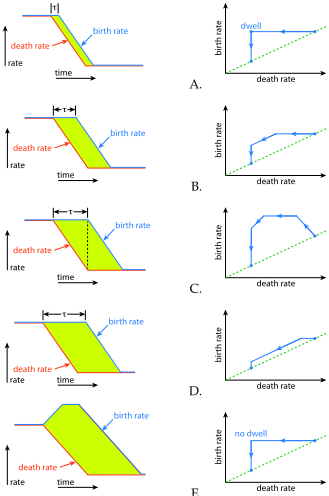
E.
Referring to the figures for Problem 22 (and described within the same problem), which pair[43] corresponds to the largest population surge, and which pair produces the smallest? Explain your reasoning, consistent with the presentation in the text.
Referring to the figures for Problem 22 (and described within the same problem), which pair[44] is most similar to the actual trajectory we witness (i.e., Figure 3.11), and what does this say about the
population cost of the demographic transition in the context of Problem 23?
Considering Figure 3.11 in the context of a trajectory (as in Figure 3.12), would it appear that most countries in the world have begun the demographic transition? Have very few of them started? Is it about half-and-half? Justify your answer.
Express your view about what you learn from Figure 3.17. Do you sense that the prescribed trajectory is realistic? If so, justify. If not, what about it bothers you? What does this mean about the goal of bringing the (growing) world to “advanced” status by the end of this century? Are we likely to see this happen?
Make as compelling an argument as you can for why we should promote the demographic transition worldwide for those countries who have not yet “arrived” at the lower-right corner of Figure 3.10. What are the positive rewards?
Make as compelling an argument as you can for why pursuit of the demographic transition may be ill-advised and potentially create rather than alleviate hardship. What are the downsides?
List the pros and cons a young person without children might face around the decision to have a biological child of their own[45] Consider not only personal contexts, but external, global ones as well, and thoughts about the future as you perceive it. It does not matter which list is longer or more compelling, but it is an exercise many will go through at some point in life—although maybe not explicitly on paper.
Do you think governments and/or tribal laws have any business setting policy around child birth policies? If so, what would you consider to be an acceptable form of control? If not, what other mechanisms might you propose for limiting population growth (or do you even consider that to be a priority or at all appropriate)?
… so that global average energy use per capita increases by a factor of five from where it is today
… except that famine and plague took a toll in the 14th century
… recalling that that the natural log and exponential functions “undo” each other (as inverse functions)
Gppl is giga-people, or billion people
For reference, the SARS-CoV2 pandemic of 2020 barely impacted global population growth rates. When population grows by more than 80 million each year, a disease killing even a few million people barely registers as a hit to the broader trend.
… no negative feedback yet
We have just described a state of positive feedback: more begets more.
is a time derivative (note the dot on top), defined as . But don’t panic if calculus is not your thing: what we describe here is still totally understandable.
A more adorable term for “units” is fawns, in this case.
The parameter is the time when the logistic curve hits its halfway point. Times before this have negative values of .
… tuned for a convenient match to the numbers we have used in the foregoing examples
Not coincidentally, at the halfway point, .
… meaning that population arrives at
For instance, a dramatic overshoot and collapse could be disruptive enough to take out our current infrastructure for fossil-fuelaided agriculture so that the value essentially resets to some lower value.
This ignores immigration, which just shifts living persons around.
4 per 1,000 is 0.4 per 100, which is another way to say 0.4 percent.
Note that immigration is not considered here: just birth rate and death rate within the country.
… but unsolicited “preaching” to others
Better hospitals and schools are not free.
One may justifiably question whether this is the “correct” goal.
But check back in 100 years!
Although, the continent as a whole accounts for 35% of the total added population each year.
The average American rate of energy use is 10,000 W vs. 50 W for Niger.
In other words, for every additional kilogram of coal, steel, or whatever required by Niger’s added population, the U.S. will require 400 kg of the same to satisfy its population growth.
28 is smaller than 400 by the ratio of populations in the two countries.
This does not even consider rising standards placing additional burdens.
A citizen of Niger, by comparison, only adds 1.7 W of demand per year on energy resources via population growth.
Note that European countries are nervous about their decline in a growing, competitive world.
Reasons for having children are numerous: genetic drive; family name/tradition; labor source; care in old age; companionship and love (projected onto not-yet-existing person). Note that adoption can also satisfy many of these aims without contributing additional population.
This is another case of delay in negative feedback resulting in overshoot.
A group size of 1,200 is small enough to prevent hiding irresponsible actions behind anonymity.
See, for example, Figures 3.3 and 3.4.
This is due to the property of logarithms
Determine graphically (may need to zoom in). See Problem 2 and the associated graphic to better understand how the tick marks work. 38: I.e., don’t say 0.01 billion if 10 million is more natural, or 8,000 million when 8 billion would do.
Numbers may change from when the plot was made; population can help settle based on dot size.
… much farther from dashed line
Note that figures A. and E. differ only by whether the transition pauses (dwells) at the corner for some time.
… number and associated letter; not necessarily arranged next to each other
… number and associated letter; not necessarily arranged next to each other
Assume for the purpose of the question that it is biologically possible.