Graphing with Gnuplot
Gnuplot is a free, open-source software package for producing a variety of graphs. Versions are available for many operating systems. Below is a very brief tutorial on how to use Gnuplot to graph trigonometric functions.
INSTALLATION
Go to http://www.gnuplot.info/download.html and follow the links to download the latest version for your operating system. For Windows, you should download the setup file with a name such as
gp460-win32-setup.exe, which is version 4.6.0. All the examples discussed here will assume at least version 4.6.0, though they should work with earlier 4.x versions.Install the downloaded file. For example, in Windows you would run the setup file you downloaded in Step 1, which installs Gnuplot in the
C:\Program Files\gnuplotfolder by default. You can accept the defaults during installation, though you should select the “Create a desktop icon” option in the Select Additional Tasks screen.(Optional) Read the documentation at http://gnuplot.info/documentation.html.
RUNNING GNUPLOT
In Windows, run
wgnuplot.exefrom thebinfolder where you installed Gnuplot (the default location isC:\Program Files\gnuplot\bin\wgnuplot.exe), or double-click the desktop icon if you selected that option during the installation. In Linux, just typegnuplotin a terminal window.You should now get a Gnuplot terminal with a
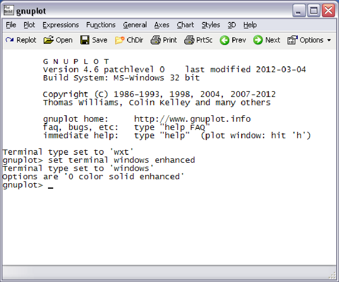
gnuplot>command prompt. In Windows this will appear in a new window, as shown in the picture on the next page. In Linux it will appear in the terminal window where thegnuplotcommand was run. For Windows, if the font is unreadable you can change it by right-clicking on the text part of the Gnuplot window and selecting the “Choose Font..” option. For example, the font “Courier”, style “Regular”, size “12” is usually a good choice (that choice can be saved for future sessions by right-clicking in the Gnuplot window again and selecting the option to update wgnuplot.ini).At the
gnuplot>command prompt you can now run graphing commands, which we will now describe.
GRAPHING FUNCTIONS
The usual way to create graphs in Gnuplot is with the plot command:
For a function \(y=f(x)\), <range> is the range of \(x\) values (and optionally the
range of \(y\) values) over which to plot. To specify an \(x\) range, use an expression of the form
[\(a:b\)], for some numbers \(a<b\). This will cause the graph to
be plotted for \(a\le x\le b\).
To specify an \(x\) range and a \(y\) range, use an expression of the form [\(a:b\)][\(c:d\)], for some numbers \(a<b\) and \(c<d\). This will cause the graph to be plotted for \(a\le x\le b\) and \(c\le y \le d\).
Function definitions use the \(x\) variable in combination with mathematical operators, listed below:
| Symbol | Operation | Example | Result |
| \(+\) | Addition | \(2 + 3\) | \(5\) |
| \(-\) | Subtraction | \(3 - 2\) | \(1\) |
| * | Multiplication | \(2\)*\(3\) | \(6\) |
| \(/\) | Division | \(4/2\) | \(2\) |
| ** | Power | \(2\)**\(3\) | \(2^3 = 8\) |
| exp(\(x\)) | \(e^x\) | exp(\(2\)) | \(e^2\) |
| log(\(x\)) | \(\ln x\) | log(\(2\)) | \(\ln 2\) |
| sin(\(x\)) | \(\sin x\) | sin(pi/\(2\)) | \(1\) |
| cos(\(x\)) | \(\cos x\) | cos(pi) | \(-1\) |
| tan(\(x\)) | \(\tan x\) | tan(pi/\(4\)) | \(1\) |
Note that we use the special keyword “pi” to denote the value of \(\pi\).
width height 0.5pt
Example B.1.
To graph the function \(y=\sin\;x\) from \(x=0\) to \(x=2\pi\), type this at the
gnuplot> prompt:
The result is shown below:
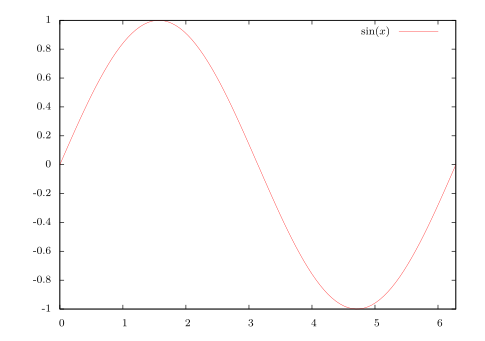
Notice that the \(x\)-axis is labeled with integers. To get the \(x\)-axis labels with fractions of
\(\pi\), you need to modify the terminal setting. In Windows, you would do this:
In Linux you would do this:
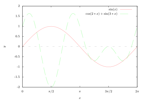
You can then (provided the Symbol font is installed, which it usually is) set the \(x\)-axis to have multiples of \(\pi/2\) from \(0\) to \(2\pi\) as labels with this command (all on one line):
In the above example, to also plot the function \(y=\cos\;2x + \sin\;3x\) on the same graph, put a comma after the first function then append the new function:
By default, the \(x\)-axis is not shown in the graph. To display it, use this command
before the plot command:
Also, to label the axes, use these commands:
The default sample size for plots is \(100\) units, which can result in jagged edges if the curve is complicated. To get a smoother curve, increase the sample size (to, say, \(1000\)) like this:
Putting all this together, we get the following graph:
PRINTING AND SAVING
In Windows, if you are using the windows enhanced terminal then to print a graph from
Gnuplot click on the printer icon in the menubar of the graph’s window. If you are using the
default wxt terminal then select Print near the top of the main Gnuplot window
and enter png in the Terminal type? textfield, then hit OK to get the Print Setup
dialog.
In Windows, to save a graph, say, as a PNG file, go to the File menu on the main Gnuplot menubar,
select “Output Device ...”, and enter png in the Terminal type? textfield, hit OK. Then, in the
File menu again, select the “Output ...” option and enter a filename (say, graph.png) in the Output
filename? textfield, hit OK. Now run your plot command again and the file will be saved in the
current directory, usually in your My Documents folder (it can also be found by
selecting the “show Current Directory” option in the File menu).
In Linux, to save the graph as a file called graph.png run the following commands:
set terminal png |
set output ’graph.png’ |
and then run your plot command. There are many terminal types (which determine the output format). Run
the command set terminal to see all the possible types. In Linux, the postscript terminal type is
popular, since the print quality is high and there are many PostScript viewers available.
To quit Gnuplot, type quit at the gnuplot> command prompt.